
Web Site User’s Guide for Pathway Tools-Based Web Sites
A note on browsers:
At present, our preferred browsers are Firefox and Chrome (often faster)
Less recommended are Safari and Edge.
Contents
2 Selecting the Database to Search
3 Searching Pathway/Genome Databases
3.1 Quick Search
3.2 Search Menu: Object Searches
3.3 Tools Menu → Search → Cross Organism Search
3.4 Tools Menu → Search → BLAST search
3.5 Tools Menu → Search → Google This Site
3.6 Tools Menu → Search → Search Full-text Articles
5 Genome Explorer Genome Browser and Circular Genome Viewer
5.1 New Genome Browser: Basic Mode
5.2 New Genome Browser: Comparative Mode
5.3 New Genome Browser: Tracks Mode
5.4 Circular Genome Viewer
6 Older Genome Browser
6.1 Older Genome Browser: Tracks Mode
6.2 Older Genome Browser: Comparative Mode
7 SmartTables
7.1 SmartTable Structure and Display
7.2 SmartTable Directory
7.3 Creating a SmartTable
7.4 Adding SmartTable Columns
7.5 Other SmartTable Manipulations
7.6 SmartTable Analysis Operations
7.7 Exporting and Sharing a SmartTable
7.8 Publishing a SmartTable
7.9 Browsing SmartTables and Users
9 Cellular Overview (Metabolic Map Diagram)
9.1 Summary of Commands and Controls
9.2 Searching and Highlighting
9.3 Cellular Omics Viewer — Overlay Experimental Data
10 Metabolic Models
10.1 How to Use the Web-MetaFlux Modeling Tool
10.2 Selecting a Model of Interest
10.3 Executing a Model
10.4 Inspecting and Modifying a Metabolic Model
11 Metabolic Route Search and Metabolic Network Explorer
11.1 Metabolic Route Search
11.2 Metabolic Network Explorer
13 Regulatory Overview (Regulatory Network Diagram)
14 Comparative Analysis
14.1 Show this Gene/Compound/Reaction/Pathway in Other Databases
14.2 Compare Individual Pathways and Reactions
14.3 Comparative Analysis Tables
14.4 Comparative Genome Dashboard
15 Sequence Search and Alignment
15.1 BLAST Search
15.2 PatMatch Sequence Search
15.3 Sequence Alignment Viewer
16 Translation Services
16.1 Metabolite Translation Service
16.2 Map Sequence Coordinates
1 Overview
This document describes how to use Web sites based on the Pathway Tools software from SRI International. Since multiple Web sites such as BioCyc, YeastCyc, AraCyc, and MouseCyc are all based on the same underlying software, the same usage instructions apply to all. (Note that differences in configuration and in software version may introduce some variability among sites).
Please note that the desktop version of Pathway Tools that you can install locally provides some additional operations compared to the Web capabilities described here. Click here for more details.
2 Selecting the Database to Search
Most searches within this website search within a single organism database. The database against which searches will be conducted is indicated below the Quick Search box just below the menu bar (see figure below). In most cases, a database describes a single organism – although a small number of multi-organism Pathway/Genome Databases exist (examples include MetaCyc and PlantCyc). Operations that search multiple databases are described in Sections Object Searches, Cross Organism Search, and Google This Site.
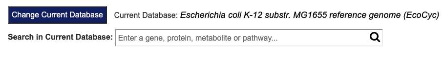
To change the default organism database for searches, click on the “Change Current Database” button above the Quick Search box. In the “Select an organism database” window that pops up, you can search for the organism of interest in several possible ways. You can type in any combination of its genus name, species name, and strain name — for example, the strain name is often a quick way to find an organism because it is usually unique. You can also find organisms by taxonomy, or by querying various organism properties.
If the Website supports user accounts, and you are logged in, you may save one database as your preferred database by checking the box in the bottom-left corner of the “Select an organism database” window. This database will be your default selection when starting a new web session.
Once you have selected the desired database from one of the tabs described below, click OK to exit the organism-selection dialog. This will navigate to the page of summary statistics for the selected database.
Note that if you follow a link to a page for a different organism database, then the selected database for searching will change to match the organism of the currently displayed page.
Organism Selector: By Name Tab
By default, the By Name tab will initially be selected in the “Select an organism database” window. If a small number of databases is available, a full scrollable list of databases is present to select from. When a large number of databases is available, you must start typing or select a starting letter from the alphabetical index to the left of the database list in order to see the list of matching databases. If you start typing an organism name or select a starting letter, the full list of databases (if available) will be replaced by a list of databases matching the typed string or starting with the selected letter — you can use the mouse or the up/down arrows on your keyboard to select the desired database. An organism name will match the string you type if any word in its name (i.e., genus, species, or strain name) starts with the string you type.
In the list of matching databases, some database names may be displayed with a colored background – these indicated databases that have had some level of manual review and/or curation. Tier 1 databases, i.e. those that have received at least a year of literature-based curation, will have an orange background. Tier 2 databases, i.e. those with a lower level of manual curation, will have a blue background. All others are Tier 3 databases, which means they have been computationally generated with little or no manual review. Lists of your recently used databases and the site’s most popular databases on the left side of the selection window provide shortcuts for selecting those databases.
Organism Selector: By Taxonomy Tab
The By Taxonomy tab allows you to select an organism by browsing for it. After the name of each class of organisms is listed the number of organism databases in that class. The taxonomy tree does not include all taxonomy classes, only those that contain at least one organism database – if a particular taxon does not appear in the tree, it means there is no database available for it or its children. Clicking on a class name will show or hide its list of child taxa. Clicking on an organism name will select that database and show its name at the top.
You may search for any taxon by starting to type its name in the text box. If you select one of the options from the resulting auto-complete box, the taxonomy will automatically expand to show the selected taxon (you must still click on the organism name in the taxonomy to select that database, however).
Organism Selector: By Organism Properties Tab
The By Organism Properties tab allows you to query for all organisms that have (or do not have) some property. The types of properties that can be queried (known as the organism “metadata”) include attributes of the organism and sample, such as when and where and from what host the sample was collected, whether or not the organism is a pathogen, its relationship to oxygen (e.g. aerobic or anaerobic), and attributes of the database, such as how many pathways or genes or Gene Ontology terms it has. Not all organism databases contain data for each of these attributes. In the list of properties from which to select, the number of databases that have values for that property as well as a description of the property is listed in the tooltip.
After selecting a property, you can constrain its value, or just select all databases that have (or do not have) any value for that property. To select from a list of all available values, click in the text box. In the resulting list of possibilities, the number in parentheses after each value is the total number of organisms that match that value. If you start to type, the list of visible options will be limited to those that match the string you have typed. Multiple options may be selected by clicking in the text box again after selecting a value – in that case, an organism will satisfy the constraint if it matches any of the selected values (i.e. the values are connected by an implicit OR). For properties whose values consist of free text, you may also query by substring. The first few values that match your substring are shown, but you are not obligated to select any of them. For properties whose values are numeric, a variety of numeric operators are available, as well as the option to select from all available values. If you specify an = constraint, an organism will satisfy the constraint if its value falls within a small range on either side of the specified value – the size of this range depends on the property, and is indicated below with the description of each property. To specify a different range, use a combination of < and > constraints.
Up to six different constraints may be specified (use the “Add Constraint” button to add a new constraint, up to the limit). These may be connected by either AND (an organism must satisfy both constraints) or OR (an organism may satisfy either constraint). Since there is no way to group constraints, if you are are building a query that combines both ANDs and ORs, ordering becomes very important. Queries are processed in a left-to-right order, so X AND Y OR P AND Q is interpreted as ((X AND Y) OR P) AND Q. If the ordering of constraints do not allow for a desired query, you may be better off splitting your query into multiple queries and searching for the desired organism one part of the query at a time.
The following properties are available for searching:
Environment: This property encompasses terms that describe the environmental features and habitats where the sample was taken. This can include biome-level terms, such as desert, deciduous woodland, coral reef; geographic features such as harbor, cliff, lake; and/or environmental material such as air, soil, water. It can also include terms related to host environment (e.g. blood, skin, oral cavity, gut). This slot combines the MIGS concepts biome, feature, material, body_habitat, body_site and body_product. Ideally, terms should be taken from the EnvO or the FMA ontologies, but can also be free text. An organism may have multiple different values for this property.
Geographic Location: The geographical origin of the sample, defined by country or sea name, and/or specific region name. This property can have multiple values, e.g. one might be a country name, another a region name, and another text describing the specific location.
Latitude: The latitude of the geographical origin of the sample. Values are reported in decimal degrees, in the WGS84 system. Positive numbers are North, negative numbers are South. If you specify an = constraint for this property, all organisms whose latitude is within 10 degrees of the requested value will be included in the result. If you wish a different size range, you will need to specify it explicitly by combining < and > constraints.
Longitude: The longitude of the geographical origin of the sample. Values are reported in decimal degrees, in the WGS84 system. Positive numbers are East, negative numbers are West. If you specify an = constraint for this property, all organisms whose longitude is within 10 degrees of the requested value will be included in the result. If you wish a different size range, you will need to specify it explicitly by combining < and > constraints.
Depth/Altitude: The depth or altitude in meters at which the sample was collected. Negative numbers are depths, positive numbers are altitudes. If you specify an = constraint for this property, all organisms whose depth or altitude is within 20% of the requested value will be included in the result. If you wish a different size range, you will need to specify it explicitly by combining < and > constraints.
Collection Date: The year the sample was collected.
Relationship to Oxygen: Whether the organism is an aerobe or anaerobe, and what form.
Trophic Level: The position of the organism in a food chain.
Temperature Range: A qualitative description of what kind of temperature range the organism grows best in. A mesophile grows best in moderate temperatures, typically between 20 and 45 degrees Celsius. A psychrophile prefers colder environments, whereas a thermophile prefers warmer ones, and a hyperthermophile thrives in extremely hot environments of 60 degrees Celsius and higher.
Biotic Relationship: Whether the organism is free-living or in a host, and if the latter, what type of relationship is observed.
Pathogenicity: The general class of organisms to which the organism is pathogenic.
Host: The host from which the sample was isolated.
Human Microbiome Body Site: For organisms that are part of the Human Microbiome Project or otherwise have human hosts, the general body site where the sample was collected, e.g. blood, oral, gastrointestinal tract.
Health/Disease State: The health or disease state of the specific host at the time of collection.
Ploidy: The ploidy level of the genome, e.g. haploid, diploid, triploid, allopolyploid.
Genome Size: The size of the organism’s genome in base pairs.
# of Pathways: The number of pathways in the database.
# of Genes: The number of genes in the database.
# of Enzymes: The number of enzymes in the database.
# of GO Terms: The number of Gene Ontology terms that have annotations to them in the database.
# of Gene Essentiality Datasets: The number of gene essentiality datasets that have been incorporated into the database.
# of Genes with Essentiality Data: The number of genes in the database that have essentiality information from at least one gene essentiality dataset.
# of Transporters: The number of transporters in the database.
# of Transcriptional Regulatory Interactions: The number of transcriptional regulatory interactions in the database.
# of Phenotype Microarray Datasets: The number of phenotype microarray datasets that have been incorporated into the database.
# of Protein Features: The number of protein features in the database.
Once you have specified the desired constraints, use the “Find Organisms” button to search for all matching organisms. In the resulting table, which includes all properties for which at least one of the matching organisms has a value, you may click on any column heading to sort by that column. Click on a row to select that organism.
Organism Selector: Having Metabolic Models Tab
The Having Metabolic Models tab allows you to select from organisms that have metabolic models associated with them, either public models or models that you have created. See the Section 10, Metabolic Models, for more information about creating or running metabolic models.
3 Searching Pathway/Genome Databases
Most searches, including via the Quick Search box at the top of every page, search against the currently selected organism database only. Thus you should select the organism you are interested in before initiating a search. See the previous section for information about selecting the current organism. However, several options exist for searching across multiple organisms:
Select the Search across multiple organisms/databases option under several of the type-specific search pages. This option provides for structured searches across a small number of organisms, and is available for the commands Search Genes, Proteins or RNAs; Search Compounds; Search Reactions; and Search Pathways.
Cross Organism Search supports name-based searching across all organisms or a specified subset (BioCyc only).
BLAST All BioCyc supports BLAST searches across all BioCyc organisms (BioCyc only).
In addition, most data pages include one or more options in the Operations menu on the right side of the page to search or otherwise compare the currently displayed object (gene, pathway, etc.) across multiple organisms.
3.1 Quick Search
The Quick Search box in the upper region of every page is useful if you know the name (or part of the name) or database identifier of the object you are searching for. You may use this box to search for genes, proteins, compounds, RNAs, reactions, pathways, operons, and GO terms. If the search string matches a single object, the page for that object will be displayed immediately. If there are multiple matches, the full list of matches will be shown, organized by the type of object (e.g. gene, protein, etc.). Some examples of what can be entered into the Quick Search box include:
The name of a gene, protein, RNA, compound, pathway, operon, extragenic site, or growth medium. Spaces, punctuation and capitalization are ignored. An object will be returned if the query string matches either its common name or one of its synonyms.
Examples: pyruvate, trpAA substring of one of the above names that is 3 or more characters in length.
Examples: pyr, kinaseThe name of an organism for which a database exists within this website.
Examples: pseudomonas aeruginosa DK1An EC number (full or partial).
Examples:1.2.3.3, 1.3.99A PGDB internal object identifier for a gene, protein, RNA, compound, pathway, reaction, transcription-unit, extragenic site, growth medium, or schema class. Correct capitalization may be required.
Examples:CPLX0‑3661, HEMN‑RXNA PGDB internal object identifier for any compound, gene, protein, pathway, reaction, transcription-unit or schema class in some other PGDB served at the same website, followed by ’@’ and the PGDB identifier (no spaces).
Examples:trp@ecoo157, HEMN‑RXN@METAAn identifier from some external database to which we maintain links, e.g., a UniProt identifier or GO term. Correct capitalization and punctuation is required. Note that our set of links is not complete – just because a search for an external ID returns no result does not mean that we do not have the object in our database.
Examples:P00561, NP\_414543, C00047A compound InChI-key (full or partial).
Examples:CKLJMWTZIZZHCS‑REOHCLBHSA‑M, CKLJMWTZIZZHCS‑REOHCLBHSA, CKLJMWTZIZZHCS
A few additional rules govern Quick Searches:
To match several words or text-fragments simultaneously, type in the words separated by spaces to find an object with all the words in its name, or separated by commas to find objects with any of the words in its name. For example, if you enter nitrate camphor in the Quick Search box, the site will search for a single object that has both nitrate and camphor in its name. However, entering nitrate, camphor would result in a Quick Search for objects having either nitrate or camphor in their names.
Searches may be qualified. Currently we allow two qualifiers:
search:exact
Example Quick Search: trpa search:exact
This Quick Search will be limited to exact matches. In the example given, assuming the current organism is E. coli K-12, without the search:exact qualifier there will be several matches including genes, proteins and transcription units. With the qualifier, the search will take you directly to the trpa gene page.type:<type-qualifier>
Example Quick Search: atp type:compound
This Quick Search will search the specified type of object only. In this example, assuming the current organism is E. coli K-12, without the type qualifier a large number of results will be returned of various types. With the qualifier, just the seven compounds with ATP in the name will be returned.
Allowable type-qualifiers are pathway, gene, enzyme, rna, go-terms, compound, reaction, operon, and organism.
If your query text is one or two characters in length, only exact text matches will be returned because of the many matches that would otherwise result. For longer text fragments, the search will return all objects that contain the text rather than match it exactly.
3.2 Search Menu: Object Searches
The Search section of the Tools menu contains links to specialized search pages for Compounds, Genes/Proteins/RNAs, Reactions and Pathways. Each such page contains options for searching using a number of different criteria, either individually or in combination. When the page is initially loaded, only the name searches are active, but by clicking on the different search bars, you can enable or disable additional search criteria. If multiple search criteria are specified for a given search, then unless otherwise specified the results must satisfy all of them (that is, an AND connector is used to combine the different criteria). By default, these type-specific searches search only the currently selected organism or database. However, for most of the search pages described below, the first search bar when enabled will allow you to conduct a search across multiple organisms. Simply check the box to search across multiple organisms/databases and specify the desired organisms using the multi-organism selector. Searches across large numbers of organisms may be time-consuming. For this reason, a maximum of 70 organisms can be selected. To search across larger numbers of organisms (BioCyc.org only), see Cross Organism Search.
The results of all object searches is a table containing the names of all objects that satisfy the search, with hyperlinks to their corresponding data pages, along with any additional columns relevant to the particular search. The table will initially be sorted alphabetically by name, but small triangles in the column headers allow the user to sort by any column, in either ascending or descending order. The sections below describe the different search criteria that are available for each object type.
3.2.1 Tools Menu → Search → Search Genes, Proteins or RNAs
Search by gene name or database identifier
Enter a gene name, name fragment, or identifier (either the internal Pathway/Genome Database identifier, or an identifier from some other database). The software will attempt to do auto-completion on the string you have entered based on the contents of the database. If you select one of the auto-complete options, then when you submit the form you will be taken directly to the data page for the selected gene, regardless of any other search criteria you may have specified (i.e., other search criteria are ignored). If you do not select one of the auto-complete options, then the string you typed will be the target of a substring search, which may be combined with other search criteria.Search by product name, database identifier or EC number
Enter a protein or RNA name, name fragment, identifier (either the internal Pathway/Genome Database identifier or an identifier from some other database, such as UniProt), or a fully specified EC number. The software will attempt to do auto-completion, as for the gene name field.Search/Filter by sequence length
Enter a minimum and/or maximum sequence length, and specify whether the units referred to are nucleotides or amino acids. If either the minimum or maximum field is left blank, then the sequence length is unconstrained in that direction.Search/Filter by replicon and/or gene map position
Enter a minimum and/or maximum gene map position, where the units are the number of base pairs from the start of the replicon. The results will include any gene that overlaps any portion of the specified region. If either the minimum or maximum field is left blank, then the map position is unconstrained in that direction. If the selected organism has multiple replicons, then this search option will include a checkable list of replicons – you may select one or more replicons either instead of or in conjunction with the map position in order to constrain the search to genes on a particular replicon.Search/Filter by product molecular weight
Enter a minimum and/or maximum molecular weight for the gene product in kilodaltons. If either the minimum or maximum field is left blank, then the sequence length is unconstrained in that direction.Search/Filter by pI
Enter a minimum and/or maximum pI (isoelectric point) for the gene product. (Typically little information about pI is available for databases other than EcoCyc or MetaCyc.)Search/Filter by small molecule regulator, cofactor, substrate or ligand
This search option is for retrieving all proteins affected by a specified small molecule in any of several ways. An example might be to search for all enzymes inhibited by ADP, or all enzymes that use Mg2+ as a cofactor. Enter the name of a small molecule. We recommend taking advantage of the auto-complete facility to select the correct small molecule, as only an exact match to a compound name can be accepted here. Check all roles that you are interested in for this compound. Note that we consider cofactors to include only compounds that are not modified in any way during the reaction. Molecules such as NAD, which are modified, are considered to be substrates, not cofactors. (Relatively little information about activators, inhibitors, etc. is typically available for databases other than EcoCyc or MetaCyc.)Search/Filter by evidence code
The evidence ontology appears here in browsable form. Each evidence code includes in parentheses after its name the number of gene products that have their function annotated with that code. Selecting one or more codes to filter on allows you to restrict your search, for example, to all proteins whose function has been established experimentally. The Pathway Tools evidence codes and ontology are described here.Search/Filter by cell component
The cell component ontology appears here in browsable form, along with the numbers of gene products associated with each cell component. Selecting one or more components allows you to restrict your search to proteins known to be present in those cellular locations. (Note that relatively little information about cellular locations of gene products is available for databases other than EcoCyc or MetaCyc.) The Pathway Tools cell component ontology is described here.Search/Filter by Gene Ontology
If the selected database has been annotated using Gene Ontology, then you will see a browsable ontology here. Only terms that have one or more gene products annotated to them or their children will be present, and the number in parentheses after each term name indicates the number of gene products annotated to that term or one of its children. You may browse this ontology to a particular term to see all gene products annotated with that term. Clicking on a gene product will then take you directly to the data page for that gene product, just as clicking on a term name will take you to the data page for that term. Alternatively, you can use the checkboxes to indicate that your search should be restricted to include only gene products annotated with the checked terms or their children. If you wish to filter by only a single term, and you know the name or ID for that term, you also have the option of typing it in the text box (using auto-completion to ensure you select the correct term). Select one or more GO evidence codes to restrict the search results to GO term matches with one of the selected evidence codes.Search/Filter by organism
This search option will be available only if the selected database is a multi-organism database (such as MetaCyc), and allows you to browse directly for proteins from a particular organism, or to restrict your search to one or more taxonomic groups.Search/Filter by publication
This search option is useful for retrieving a list of all genes or gene products that cite a given publication or author. Enter either the PubMed ID, the author surname, or part or all of an article title.Search/Filter by existence of protein features
This search option generates a browsable ontology of protein features. Select one or more feature types to search for proteins annotated with those features.
3.2.2 Tools Menu → Search → Search Compounds
Search for compound by name or ID
Enter a compound name, name fragment, or identifier (either the internal Pathway/Genome Database identifier, or an identifier from some other database such as PubChem or LIGAND). The software will attempt to do auto-completion on the string you have entered based on the contents of the database. If you select one of the auto-complete options, then when you submit the form you will be taken directly to the data page for the selected compound, regardless of other search criteria you may have specified (i.e., other search criteria will be ignored). If you do not select one of the auto-complete options, then the string you typed will be the target of a substring search, which may be combined with other search criteria.Search/Filter by ontology
This option allows you to browse the compound ontology. Each compound class includes in parentheses after its name the number of instance-level compound objects that are members of that class. Clicking a + icon shows the classes and compounds that belong to a particular class. The ontology may be used in one of two ways. By selectively clicking on + icons, you can browse to find a compound or compound class of interest, and click directly on its name to visit the data page for that compound. Alternatively, you can check the checkbox next to one or more class names to limit your search (which may also include other search criteria) so as to only include compounds that belong to one of the checked classes.Search/Filter by monoisotopic molecular mass
For searching for matches to mass spectroscopy results, enter one or more monoisotopic molecular masses, and specify the desired tolerance.Search/Filter by molecular weight
This option can be used to specify either a minimum molecular weight value, a maximum molecular weight value, or both. If either the minimum or maximum field is left blank, then the molecular weight is unconstrained in that direction.Search/Filter by chemical formula (partial or full)
If one or more element symbols are entered without a number, then the result will include any compound containing those elements (and possibly some others). If an element symbol is followed by a number, then only compounds with exactly that number of that element in its chemical formula will be included in the result. For example, the query string C12N will retrieve all compounds with exactly 12 carbons, one or more nitrogens, and possibly some other elements. The search is case-insensitive unless case is needed to disambiguate. For example, either co or CO will retrieve all compounds containing both carbon and oxygen, but Co will instead retrieve all compounds containing cobalt.Search by InChI string
InChI is short for International Chemical Identifier, and offers a way to search for a molecule by its chemical structure. We support only exact string matching for InChI strings.Search by InChI key
An InChI key is a compressed formulation of the InChI string. You may enter either the full InChI key, or a partial InChI key that omits either the charge or the isomer and charge information.
3.2.3 Tools Menu → Search → Search Reactions
Search for reaction by EC number or name
Enter a reaction EC number or name (typically an enzyme name). EC numbers can be either full or partial. The software will attempt to do auto-completion on the name or EC number. If you select one of the auto-complete options, then when you submit the form you will be taken directly to the data page for the selected reaction or reaction class, regardless of any other search criteria you may have specified (i.e., other search criteria will be ignored). If you do not select one of the auto-complete options, then the string you typed will be the target of a substring search, which may be combined with other search criteria.Search/Filter by substrates or products
Enter a compound name to retrieve all reactions in which that compound participates either as a substrate or product. Multiple compounds can be specified, separated by either OR, AND or AND NOT. When multiple compounds are specified, they can appear anywhere in the reaction equation, or they can be restricted to being on either the same or opposite sides of the reaction relative to each other. We recommend taking advantage of the auto-complete facility to select the correct compound, as only an exact match to a compound name can be accepted here.Search/Filter by whether or not reaction is catalyzed by an enzyme
Specify whether to include only enzyme-catalyzed reactions for which an enzyme has been identified, enzyme-catalyzed reactions for which no enzyme has been identified, or spontaneous reactions.Search/Filter by ontology
This option allows you to browse the Pathway Tools reaction ontology. Each reaction class includes in parentheses after its name the number of reactions that are members of that class. The ontology may be used in one of two ways. By selectively clicking on + icons, you can browse to find a reaction of interest, and click directly on its name to visit the data page for that reaction. Alternatively, you can check the checkbox next to one or more class names to limit your search (which may also include other search criteria) so as to only include reactions that belong to one of the checked classes. Note that there are two parallel reaction classification systems, one in which reactions are classified by conversion type (this includes the entire EC hierarchy), and another in which the reactions are classified by substrate. Most reactions in the database have parents in both classification systems.Search/Filter by cellular location
Select one or more cell compartments to filter the result to only include reactions that occur in those compartments. Transport reactions will not be included.
3.2.4 Tools Menu → Search → Search Pathways
Search for pathway by name
Enter a pathway name, name fragment, or internal Pathway/Genome Database identifier. The software will attempt to do auto-completion on the string you have entered based on the contents of the database. If you select one of the auto-complete options, then when you submit the form you will be taken directly to the data page for the selected compound. This is true regardless of any other search criteria you may have specified (i.e. other search criteria will be ignored). If you do not select one of the auto-complete options, then the string you typed will be the target of a substring search, which may be combined with other search criteria.Search/Filter by ontology
This option allows you to browse the Pathway Tools pathway ontology. Each pathway class includes in parentheses after its name the number of reactions that are members of that class. The ontology may be used in one of two ways. By selectively clicking on + icons, you can browse to find a pathway of interest, and click directly on its name to visit the data page for that pathway. Alternatively, you can check the checkbox next to one or more class names to limit your search (which may also include other search criteria) so as to only include pathways that belong to one of the checked classes.Search/Filter by number of reactions
Enter a minimum and/or maximum number of desired reactions in the pathway. If either the minimum or maximum field is left blank, then the number of reactions is unconstrained in that direction.Search/Filter by substrates present
Enter one or more compound names to retrieve all pathways in which those compounds participate as a reactant, a product, or an intermediate. If you enter more than one compound, then the pathway must involve all specified compounds in order to be included in the results. We recommend taking advantage of the auto-complete facility to select the correct compound, as only an exact match to a compound name can be accepted here.Search/Filter by evidence code
The Pathway Tools evidence ontology appears here in browsable form. Each evidence code includes in parentheses after its name the number of pathways that have their function annotated with that code. Selecting one or more codes to filter on allows you to restrict your search, for example, to all pathways whose presence has been established experimentally. The Pathway Tools evidence codes and ontology are described here.Search/Filter by organism
This search option will be available only if a multi-organism database (such as MetaCyc) is the selected database, and allows you to browse for pathways that are curated as occurring in a particular organism based on experimental information. The fact that a pathway is not stated to be present in a given organism does not mean that the organism does not have the pathway – pathways are curated for only a small subset of the organisms in which they appear.Search/Filter by expected taxonomic range
This search option will be available only if a multi-organism database (such as MetaCyc) is the selected database. Each pathway in MetaCyc has been annotated with its expected taxonomic range. This search option allows you to restrict your search to include only those pathways you could reasonably expect to see for a given taxonomic grouping, for example, to restrict your search to pathways seen in plants.Search/Filter by publication
This search option is useful for retrieving a list of all pathways that cite (either directly or through one of the pathway’s enzymes, genes, subpathways or substrates) a given publication or author. Enter either the PubMed ID, the author surname, or part or all of an article title.
3.2.5 Tools Menu → Search → Search DNA or mRNA sites
Many databases include information about DNA or mRNA sites other than genes. The kinds of sites that can be searched here include transcription units, promoters, terminators, transcription-factor binding sites, riboswitches, REP elements, transposons, phage attachment sites, etc., although most databases will not include all of these site types.
Search/Filter by Site Type
Choose one or more site types from among those available in the currently selected database. You must specify at least one site type.Search/Filter by replicon and/or map position
Enter a minimum and/or maximum map position, where the units are the number of base pairs from the start of the replicon. The results will include any site that overlaps any portion of the specified region. If either the minimum or maximum field is left blank, then the map position is unconstrained in that direction. If the selected organism has multiple replicons, then this search option will include a checkable list of replicons – you may select one or more replicons either instead of or in conjunction with the map position in order to constrain the search to sites on a particular replicon.Search/Filter by regulatory protein or RNA
Enter a transcription factor, sigma factor or regulatory protein or RNA name. Use the autocomplete functionality to select a full name, as no substring matching is done on the regulator name. If no match is found, then the database contains no regulatory interactions or sites involving that regulator. This filter is compatible only with searches for transcription units, promoters, transcription factor binding sites, attenuators, or mRNA binding sites.Search/Filter by evidence code
The evidence ontology appears here in browsable form. Selecting one or more codes to filter on allows you to restrict your search, for example, to all promoters whose location has been established experimentally. The Pathway Tools evidence codes and ontology are described here.
3.2.6 Tools Menu → Search → Search Growth Media
Some databases may include sets of growth media, along with information about whether or not the organism can grow on a particular medium and under what conditions (for example, gene knockout studies can indicate whether the organism can grow on a particular medium in the absence of a particular gene). To see the full list of growth media for a database, including an indication of which media have associated knockout data, click on the All Growth Media for this Organism button. Use the other fields of this form to search for growth media that meet certain criteria.
Search for growth media by name
Enter a growth medium name or name fragment. The software will attempt to do auto-completion on the string you have entered based on the contents of the database. If you select one of the auto-complete options, then when you submit the form you will be taken directly to the data page for the selected compound. This is true regardless of any other search criteria you may have specified (i.e. other search criteria will be ignored). If you do not select one of the auto-complete options, then the string you typed will be the target of a substring search, which may be combined with other search criteria.Search/Filter by compounds present in the medium
Enter up to four compound names to retrieve all growth media that contain either any or all of the specified compounds. We recommend taking advantage of the auto-complete facility to select the correct compound, as only an exact match to a compound name can be accepted here.Search/Filter by compounds not present in the medium
Enter up to four compound names to retrieve all growth media that do not contain any of the specified compounds. We recommend taking advantage of the auto-complete facility to select the correct compound, as only an exact match to a compound name can be accepted here.Search/Filter by observed growth
Select one or more growth levels to retrieve media on which any of the selected levels of growth have been observed. If no gene knockout is specified, then the growth levels refer to wildtype growth. If a gene is specified, then the growth levels refer to knockouts of that gene. When specifying a gene, we recommend using the auto-complete facility to select the correct gene, as only an exact name match can be accepted here.
3.2.7 Tools Menu → Search → Search DNA or mRNA Sites
Some databases include DNA or mRNA sites that are not genes, such as transcription-units, promoters, terminators, binding-sites, extragenic-sites, etc. This page includes a checklist of all types of such sites that are present in the current database. Select one or more types that you wish to search. The other fields of this form allow you to further constrain your search.
Search/Filter by replicon and/or map position
Enter a minimum and/or maximum map position, where the units are the number of base pairs from the start of the replicon. The results will include any site that overlaps any portion of the specified region. If either the minimum or maximum field is left blank, then the map position is unconstrained in that direction. If the selected organism has multiple replicons, then this search option will include a checkable list of replicons – you may select one or more replicons either instead of or in conjunction with the map position in order to constrain the search to sites on a particular replicon.Search/Filter by regulatory protein or RNA
This option allows you to search for all sites that bind to or are regulated by the specified protein or RNA. Possible proteins or RNAs can include transcription factors, sigma factors, sRNAs, sRNA accessory proteins, and other proteins or RNAs that regulated transcription or translation. As you start typing in the textbox, a menu of possible completions will appear. This menu will only include proteins and RNAs that are known to regulate transcription or translation — you must select the appropriate value from the auto-complete menu.Search/Filter by small molecule ligand
This option allows you to search for all sites that are regulated in some way by the specified small molecule. The small molecule can bind directly to or otherwise directly regulate a site (as in the case of riboswitches), or can bind to a transcription factor to either enable or prevent it from binding to a site. As you start typing in the textbox, a menu of possible completions will appear. This menu will only include small molecules that are known to regulate transcription or translation — you must select the appropriate value from the auto-complete menu.Search/Filter by evidence code
The evidence ontology appears here in browsable form. Selecting one or more codes to filter on allows you to restrict your search, for example, to all promoters whose location has been established experimentally. The Pathway Tools evidence codes and ontology are described here.
3.2.8 Tools Menu → Search → Advanced Search
The Advanced Search tool facilitates generation of queries that are more complex than those supported by the object search tools described above. Using the Advanced Search tool, you can write queries that combine data from multiple organisms or multiple types of objects, and you can search fields that are not supported by the individual object search pages. Detailed instructions for using the Advanced Search tool to construct complex queries are available here.
3.3 Tools Menu → Search → Cross Organism Search
The Cross Organism Search tool is only available on the BioCyc.org web-servers. It enable queries across all the organisms on the BioCyc.org website.
Search Terms
Enter the term(s) you wish to search for. This is a search which will match on substrings, so “trp” will match “trpA”, “trpB”, etc. Also, if you enter multiple terms, you can select whether all terms must be present, or just any one (or more) of them. For example, “any” “trp yersinia” will yield all entries for “Yersinia” and all entries for “trp” - an enormous number of entries; however, selecting “all” will limit the search results to a small, more manageable number of results.Fields to Search
One can select “Names” if the only search you want performed is on the names entities you are interested in. Selecting “Summary” means that your search will be on include looking for matches in the Summary string. The latter will be possibly less useful. For example, if the summary says “X is not in anyway similar to Y” and you’re searching on “Y”, you will retrieve a reference to the “X” entity, though you are likely not interested in this.Types to Restrict Search To
This enables you select the types of entities you’d like to search on.Number of Results Per Page
The results are presented in a “paged” table; that is, not all the results are returned in a single table (unless the result set is smaller than this value), and one can page backwards and forwards through the results.Choose Organisms
You can choose a set of organisms individually by name or property. You can also select all members of a taxonomically-related group, for example all Bacteria.
Search results are presented sorted by relevance (or match strength) in a table with clickable links, which link to the details for each matched entity. Each column in the table can be used to sort the results, with the relevance being used as the default. Re-sorting the table re-sorts all of the results, and this sorting is preserved as you navigate through the results table, from one page to the next.
3.4 Tools Menu → Search → BLAST search
This facility (not available for MetaCyc) allows you to perform sequence-similarity searches using the BLAST program to compare your protein or nucleic acid sequence against the complete genome of the selected organism database.
3.5 Tools Menu → Search → Google This Site
The Tools → Search → Google This Site command uses Google to perform a full text search over this entire Web site. Searches will not be restricted to the selected database, and can locate text strings found in page comments, help pages, and other page content not queryable by other means. Submitting this form will direct the user outside this Web site to a page generated by Google. A Google full text search is also offered as an option when a Quick Search fails to return any result (or does not return the desired result).
3.6 Tools Menu → Search → Search Full-text Articles
Textpresso is a package for indexing and searching a corpus of biological literature. Textpresso searches are available for searching a large Escherichia coli literature corpus only at the BioCyc Web site, and are available only when EcoCyc is the selected database.
Ontology Searches
An ontology is a carefully constructed vocabulary of terms, often called a controlled vocabulary. The terms are organized into a classification hierarchy (also called a taxonomy). Ontologies can be used to browse and search for objects by drilling down from more general categories to more specific ones. Each Pathway/Genome Database contains several ontologies. Those that can be searched are available from the Ontologies sub-menu in the Search menu. These ontologies can also be accessed from the object search page for their particular object type. The browsable ontologies are:
Tools → Genome → Browse Gene Ontology
Not all databases contain Gene Ontology (GO) annotations, but for those that do, GO can be browsed to see which gene products are assigned to which GO terms. Each database only contains those terms to which one or more gene products are actually assigned, so a term may be missing from the browsable ontology even though it is a valid GO term. GO can also be browsed from the Tools Menu → Search → Genes/Proteins/RNAs page.Tools → Metabolism → Browse Pathway Ontology
The Pathway Tools pathway ontology classifies pathways into groups based on their biological functions, and based on the classes of metabolites that they produce and/or consume. It is also accessible from the Tools Menu → Search → Pathways page.Tools → Metabolism → Browse Enzyme Commission Ontology
<a Enzyme Commission numbers (EC numbers) form a classification scheme for enzymes, based on the chemical reactions they catalyze. Pathway/Genome Databases use EC numbers to organize enzyme-catalyzed reactions (rather than the enzymes themselves) based on type of transformation and class of substrates. The EC ontology can also be browsed from the Tools Menu → Search → Reactions page (as a child of Chemical-Reactions). Both Tools Menu → Search → Reactions and Tools Menu → Search → Genes/Proteins/RNAs pages allow searching by EC number.Tools → Metabolism → Browse Compound Ontology
The Pathway Tools compound ontology describes small molecules, that is, chemical compounds that are not macromolecules. It is also accessible from the Tools Menu → Search → Compounds page.
4 Web Accounts
Pathway Tools Web accounts give users the ability to customize their experience when accessing PGDBs via the Web, and to store SmartTables of objects in their account.
Web site accounts provide several benefits. Through your account you can:
Define SmartTables of genes, pathways, metabolites, and more for analysis and to share with colleagues
Customize the appearance of pages on this Web site
Store organism sets for comparative operations
Receive important email updates about this Web site
To create an account, click “Create New Account” at the top right of most Web pages. (If those words are missing it probably means that Web Accounts are not enabled for this Pathway Tools Web site. The Pathway Tools User Guide describes how to enable and configure Web Accounts for a Pathway Tools Web site.)
5 Genome Explorer Genome Browser and Circular Genome Viewer
This section describes the new Genome Explorer genome browser introduced in late 2023. Genome Explorer can be used to accomplish several different tasks, all of which can lead to production of figures for publications. The main modes of operation of the genome browser are as follows.
Basic genome browser mode enables exploration of single replicons (chromosomes or plasmids), and extraction of sequences from a replicon
Comparative genome browser mode aligns multiple replicons at orthologous genes
Tracks mode enables visual analysis of positional datasets against the genome
The circular genome viewer can visually present different genomic features as a series of concentric rings
5.1 New Genome Browser: Basic Mode
The basic mode of Genome Explorer can be invoked in three alternative ways:
Select Genome → Genome Browser from the Tools menu
Click on a replicon listed in the organism summary page (that page can be created by selecting Analysis → Summary Statistics)
Click on the “View in Genome Browser” button in gene pages, on the Map Position line
At the top of the Genome Explorer page (example: https://ecocyc.org/genbro/genbro.shtml?orgid=ECOLI&replicon=COLI-K12), the full length of the chromosome is shown at low resolution. A region of the chromosome can be selected for display at higher magnification in the lower part of the screen. The selected region will be drawn using as many lines as will comfortably fit on the Web browser page. The full chromosome view at the very top indicates the magnified region by means of a red, rectangular cursor.
Users can indicate the region to magnify by the following methods:
Click on the upper full chromosome line at the desired region
Click on a gene and drag it horizontally or vertically
Enter a single basepair coordinate into the search box
Enter a basepair range (e.g., 10000-20000) into the search box
Enter a gene name into the search box
The magnified section draws genes as rectangular blocks with an arrow at one end, pointing from the 5’ to the 3’ end. ORFs for actual or inferred proteins have symmetrical arrowheads (with the arrow apex in the center), whereas RNA genes have an asymmetrical arrowhead (with the apex at the top edge). Phantom- and pseudo-genes are crossed out with a large, diagonal X. When a gene wraps across more than one line, a zigzag at the end of the line indicates that the gene continues on the next line. Click the Legend button for more details.
Additional operations supported by the basic genome browser are as follows.
Click on a gene to bring up the corresponding gene description page
Spin the mouse wheel (or scroll the trackpad — try swiping two fingers up or down) to zoom in or out
Zooming is centered on the mouse pointer
For example, to zoom in on the upstream region of a gene, point the mouse at that upstream region
Click on one of the words on the “Zoom level” line to zoom to that level of magnification, e.g., clicking “Sites” will zoom to a level that makes binding sites visible.
Right-click on a gene to bring up a menu of additional operations:
Center that gene in the browser
Open the gene page for that gene in a new tab
Create a new multi-genome alignment in the comparative genome browser
Create a multiple sequence alignment (nucleotide or amino acid) between that gene and other selected genes
Click the “Browse” button for
Genes that have not been assigned to any operon are white, whereas colored genes are part of an operon. Adjacent genes that are part of the same operon are assigned the same color, but other non-adjacent genes with the same color have no relationship. Additionally, operon extents are indicated by a gray background area behind the genes, spanning the entire region of the operon.
Moving the mouse-cursor over a gene reveals a tooltip containing its product name and the length in base pairs of the intergenic region between the chosen gene and its neighboring genes to the left and right. If the number of base pairs carries a minus sign, the genes overlap by that many bases. As an example:
Gene: xdhB Product: putative xanthine dehydrogenase subunit, FAD-binding domain Intergenic distances (bp): xdhA< +11 xdhB -3 >xdhC
This means that there are 11 bp to the left of xdhB before xdhA is reached, but to the right, xdhC overlaps with xdhB by 3 bp.
When zooming in to a great level of detail, transcription start sites, terminators, and other genomic features are drawn when available. Transcription start sites are indicated by small arrows that point toward the 3’ end of the transcript. Moving the mouse-cursor over a transcription start site reveals the operon it is part of. The transcription factors controlling the operon are also shown, with activating sites drawn in green and inhibitory sites in red. Clicking on a transcription start site brings up the corresponding transcription unit description page. Click the button “Legend & Filter” for a full list of feature types, and to filter which feature types are visible.
5.1.1 Retrieve Nucleotide or Amino Acid Sequence
Users can select regions of nucleotide sequence from the replicon currently displayed in the genome browser, and can select amino-acid sequences for proteins encoded by the current replicon.
Nucleotide Sequence Retrieval: Begin selection of a nucleotide sequence region by clicking the “Get Sequence” button and then clicking the menu item “Get Nucleotide Sequence.”
Next, be sure that the starting base for your sequence region of interest is visible in the genome browser, which is accomplished by spinning the mouse wheel to zoom in until the sequence appears, or by clicking the “Sequence” button in the “zoom level” line. Click, and drag up and down, to move left or right in the sequence and make the starting base visible.
To select the start of the region, click the “Select Start” button in the dialog and then click the start base; then click the “Select End” button and then click the end base. The sequence can be selected from either strand, but the start and end bases must be on the same strand.
The selected sequence region will be highlighted in blue. You can modify the region by clicking the “Clear” button or by clicking the “Select Start” or “Select End” button to re-select the start or end point.
By default sequences will not wrap across the origin of replication; if wrapping is desired then check the box “Wrap Around?”.
You can then click buttons to copy the sequence region to the clipboard and/or to save it to a FASTA file.
Amino-Acid Sequence Retrieval: Begin selection of an amino-acid sequence region by clicking the “Get Sequence” button and then clicking the menu item “Get Amino-Acid Sequence.”
Next, be sure that the starting residue of interest is visible in the genome browser, which is accomplished by spinning the mouse wheel to zoom in until the sequence appears, or by clicking the “Sequence” button in the “zoom level” line. Click and drag up and down to move left or right in the sequence.
To select the starting residue, click the “Select Start” button in the dialog and then click the starting residue; then click the “Select End” button and then click the ending residue. The selected sequence region will be highlighted. You can modify the region by clicking the “Clear” button or by clicking the “Select Start” or “Select End” button to re-select the start or end point.
You can then click buttons to copy the sequence region to the clipboard and/or to save it to a FASTA file.
5.2 New Genome Browser: Comparative Mode
Comparative mode of Genome Explorer can be used to examine several replicons simultaneously, side by side. This view facilitates comparison of related organisms to observe similarities and differences in their gene arrangements. For the alignment to work, ortholog links must exist among genes of the organisms to be compared (BioCyc lacks ortholog links for some pairs of organisms). The comparative genome browser is usually entered from a page describing a gene. To invoke it, select Align in Multi-Genome Browser from the operations menu on the right side of the gene page. You will first be asked to specify the organisms whose genome regions you wish to compare. The selected set of organisms is remembered for some time by the Web browser. If you wish to change the selected organisms, use the command Change organisms/databases for comparison operations in the right-sidebar operations menu.
When the comparative genome browser is invoked from a gene page, that gene and its organism (called the lead gene and lead organism, respectively) and the other selected organisms orchestrate the rest of the display. The top-most replicon shows the lead gene and is the reference organism against which comparisons are made by following the ortholog links for every gene of that replicon. The lead gene that is the focus of the comparison is highlighted on each replicon by a thick outline and hatching. The orthologs to the lead gene in each selected organism are aligned at the center positions of their lengths.
In the comparative genome browser, color indicates gene orthology. All genes in a given orthologous group are assigned the same color, out of a set of a dozen colors that are reused repeatedly. Since the same color will sometimes be reused across multiple orthologous groups, you can determine which genes are in the same orthologous group by hovering over a gene, at which time all of its orthologs will be visually highlighted.
The ortholog coloring is only present for genes that have orthologs in the top (reference) organism. Thus, if a gene in the second organism has no orthologs in any of the other organisms, or has orthologs in say organism 3 (but not the top organism), it will be shown in gray (not colored).
The display can be controlled by the following methods:
Left-click on a gene and drag it horizontally or vertically; all the aligned genomes will move in synchrony
Enter a gene name into the search box near the top to reposition at that gene
Move the mouse wheel while over a gene to zoom all the replicons in and out (or zoom with the track-pad)
Left click on an organism name and drag it up or down to reposition that replicon in the page
Right-click on a gene for an additional menu of operations:
Center Gene will center that gene horizontally within the browser, making it the lead gene. The other genomes with orthologs to that gene will be aligned to the lead gene. If the gene that was clicked on is not in the top organism then its replicon will move to the top, making it the lead organism.
Open Gene Page in New Tab opens the information page for that gene in a new tab.
New Multi-Genome Alignment at Gene starts a new comparative genome browser session centered on that gene with a newly selected set of organisms.
Browse Single Replicon at Gene enters the basic genome browser mode, centered on that gene.
5.3 New Genome Browser: Tracks Mode
Genome Explorer can plot external datasets alongside the display of a replicon, in the form of visual tracks that are present in data files uploaded by the user, as shown here. For example, tracks data might depict the strength of transcription-factor binding against regions of the genome. In this example figure, the same binding data is plotted twice in two different visual forms. The red X-Y plot consists of a set of rectangles, where each rectangle depicts binding strength against one genome region — strength of binding is plotted in the Y dimension. Below the red X-Y plot, a series of rectangles depict the same data. As for the X-Y plot, each rectangle depicts one genome region, however, strength of binding is depicted via the color of each rectangle. If you prefer one of these visual formats, the other can be deactivated.
As for the basic genome browser mode, the diagram can be zoomed using
the mouse wheel, and the diagram can be translated left-right along
the genome by clicking and dragging, or by clicking on the horizontal
bar.

The supported file format for uploading tracks data is GFF, version 2. A description of this format can be found at the end of this section.
The GFF file enables definition of many chromosomal segments that are denoted by a start and stop base-pair positions. In an attribute field of the file, a name can be assigned to these segments, and in a score field, a numerical value (such as an expression value) can be supplied. This format enables a broad range of different data types to be shown in the genome browser, aligned with the genes and transcription units that a PGDB already describes. Tracks data can include alternative gene predictions, or the results of expression experiments. Each specified segment can state a source and feature value, allowing different segment types to be supplied in one file. The external track mode of the genome browser will display different combinations of source/feature values grouped together. If in these groups some of the shown segments overlap due to their base-pair positions, such horizontal segments will be displayed on separate lines (shown in brown at the bottom of the figure), to avoid visual clashes.
To view data from such a GFF file in an external track, open Genome Explorer and click the “Tracks” button below the search bar. This click will enter tracks mode and display a “Tracks Control Panel” window; in tracks mode the magnified genome region will no longer wrap to fill the screen, instead making room for external tracks that will be displayed underneath.
Next, add tracks data from one or more external data files by clicking “Add Tracks (file)” in the control panel and selecting a file on your computer’s hard disk. Following the display of a track, you can continue to browse the genome normally, using the controls such as the mouse wheel, and the gene search box.
You can display data from more than one GFF file at the same time. Load each file individually using the procedure described above. Tracks from the first file loaded will appear just below the gene line. Tracks from the second file loaded will appear below those from the first file, and so on. The horizontal bars represent the feature data found in the GFF track file. These are arranged in rows distributed vertically, so as to help prevent overlapping features from running into each other and being indistinguishable. The number of distributed rows may vary with the zoom scale, so that features can fit; there is no other meaning to the number of lines. The length of each horizontal bar shows the extent of each individual feature from the tracks file. The color of each horizontal bar is drawn from a spectrum that encodes the magnitude of the score for that segment.
Above the horizontal bars we plot a graph of the same track feature data, in red. In the default graph drawing, each feature score is represented by a horizontal line spanning the feature’s start and end base-pair coordinates. The magnitude of the score is represented as the graph y-coordinate.
It is possible to choose to display, or turn off the display, of the horizontal bars, or the graph plot, or both. See the pull-down selector control at the start of each line in the Tracks Control panel which switches between “Bar” (which depicts each data point as a vertical line), “Point” (which depicts each data point as a point), and “(none)” (which removes the graph from the screen). To the right of that selector is a check box that toggles the visibility of the horizontal bars for that track. The numbers to the right of the check box define the Y-coordinate range for the graph. To scale or threshold the graph you can click on a number, enter the new value, and then click in a different region of the control panel. Score values that fall outside the range will result in the display of a horizontal line just a little bit outside the graph range, to visually indicate this over- or underflow condition.
5.3.1 The GFF2 File Format
Two example GFF2 files with E. coli data are as follows:
http://bioinformatics.ai.sri.com/ptools/ecoli-horizontal-predictions.gff
http://brg.ai.sri.com/ptools/ecoli-gff2-chipchip-landick-large.gff
The GFF2 format is described at http://www.sanger.ac.uk/resources/software/gff/.
The following is an example GFF2-format line:
COLI-K12 Some-DB gene 1304000 1305000 0.9 - . Gene kr2 ; Note "kr's pseudo gene 2"
Here is a short description of the 9 columns of this tab-delimited file format. The first column, called “seqname”, should contain the name of the chromosome on which the feature is to be displayed. (This field is currently ignored, and all features in the file will be shown as mapped to the currently selected chromosome.)
The second column, called “source”, should name the program making the feature prediction, or the database where the feature was found.
The third column, called “feature”, contains the type of the feature. It should follow the Genbank feature table conventions. The second and third columns together will be used to group features in the displayed tracks, but otherwise, there are currently no restrictions.
The fourth and fifth columns, called “start” and “end”, contain integers denoting the basepair location of the feature on the sequence. “Start” is always smaller than or equal to “end”.
The sixth column, called “score”, can contain a floating point number, which will be converted to a color for the feature in the display. To assign colors, the score values of all features are first examined, to allocate the color spectrum over the range of values used in the file. The data points are interpreted as absolute values on a logarithmic scale. In graph mode, the score will be converted to a corresponding height coordinate.
The seventh column, called “strand”, is currently ignored.
The eighth column, called “frame”, is currently ignored.
The ninth column, called “attributes”, is optional, and can contain semicolon-separated key-value pairs. Values following the keys called “Gene” and “Name” are displayed above the feature, though only one of these should be present per feature. A value following the key called “Note” will be displayed below the feature.
In graph mode, the entire graph track is assigned a color from a predefined set of colors. However, it is possible for the user to choose the color of a track by adding a new header comment line close to the top of the GFF file, before uploading the file. An example line is:
##color green
Several common color names can be substituted for "green".
5.4 Circular Genome Viewer
The circular genome viewer provides a global view of the organization of one or more chromosomes as a set of concentric circles (tracks) containing features (genes, promoters, binding-sites, other extragenic sites) of interest. A given track can be filtered at the outset to only show features that match certain criteria (the available selection criteria depend on the feature type), or it can include a larger set of features, and then various selection criteria can be applied after the fact to highlight subsets of features. The figure below shows an example view of a single chromosome, with tracks that showcase a variety of feature types, filtering and highlighting options.

The circular genome viewer can also be used to compare chromosomes from multiple closely related strains. In this mode, highlighting options can be applied to orthologs across multiple strains. The figure below shows the chromosomes from two Prochlorococcus marinus strains. Genes that are common to both strains are highlighted in purple, whereas genes that are unique to one strain or the other are shown in green or blue.

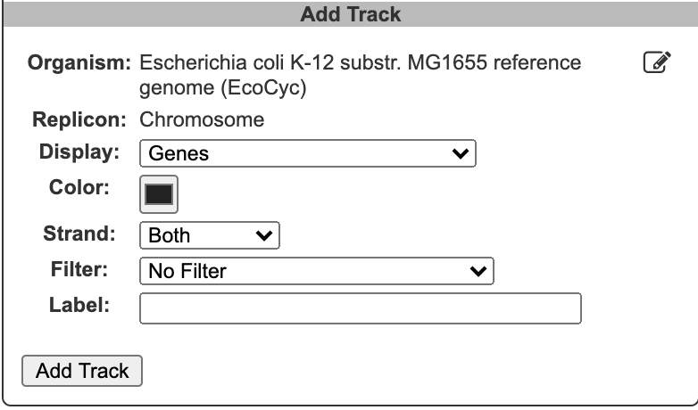
To begin generating a circular genome view, select Genome → Circular Genome Viewer from the main menu, and add one or more tracks. From the Add Track panel, select an organism (defaults to the current organism), a replicon (if the organism’s genome consists of multiple circular replicons), and a display feature type. The set of available feature types depends on the database contents. In addition to genes and coordinate labels, other possible feature types include pseudogenes, promoters, transcription factor binding sites, REP elements, and more. You can also upload your own set of features of any type from a GFF file.
For a given feature type, there are two ways to selectively indicate different subsets of features, filtering and highlighting. Filter and highlight options are currently available for genes, promoters, transcription factor binding sites, and GFF files. When you apply a filter option, you are specifying that the track should only include those features that satisfy the filter operation. All others will be omitted. Alternatively, you can show all features of the selected type, and then use the highlighting options to display a selected subset in another color. For example, if you are only interested in transporters, you might filter a gene track to only show transporter genes. If you are interested in seeing transporters in the context of their surrounding genes, you might show all genes, but then highlight the transporter genes. You can also combine filtering and highlighting options. For example, you might filter to only show transporters, and then highlight one or more particular transporter genes by name. A given track can only have one filter operation applied to it, but can have any number of highlighting operations (although a given feature can only be highlighted a single color – if a feature satisfies multiple highlighting criteria, it is arbitrary which highlight color will be shown). Thus, if there are multiple feature subsets you wish to display, it is your choice whether to show multiple tracks, each with a different filter option, a single track with multiple highlights, or some combination of the two.
For feature types that are strand-specific, you can select to show one strand only or both. By default, both strands will be shown, and no filter or highlighting will be applied. You may also optionally specify a feature color and a track label (if you do not specify a track label (name), one will be automatically generated for you). Click Add Track to create the track.
The following filtering and highlighting options are available for gene tracks:
Product type: Choose between protein-coding genes and RNA-coding genes of different types (e.g. transporters, enzymes, tRNAs, genes of unknown function).
Genes matching substring: Enter a text string to select all genes whose names or synonyms include the text.
Gene products matching substring: Enter a text string to select all genes whose product names or synonyms include the text.
Genes involved in pathway class: Use the pathway class browser to select a class (including the class of all pathways). Only those genes whose products participate in a pathway in the selected class (as enzyme or substrate) will be selected. Only a single pathway class can be selected.
Genes in regulon: For databases that include transcriptional regulatory data, choose from a list of transcription factors to select all genes directly regulated by the selected transcription factor.
Genes annotated to GO term: For databases that include GO annotations, use the GO term browser to select the desired term. Numbers in brackets after each term indicate the number of matching genes. Only a single term can be selected per track.
Genes from uploaded file: Supply a text file that contains gene names or accessions, one per line.
For databases that include transcriptional regulatory relationships, tracks for promoters and transcription factor binding sites also allow for filtering/highlighting by regulon. Promoter tracks can also be filtered/highlighted by sigma factor. GFF files can be filtered/highlighted by feature type, score or reading frame. No filtering or highlighting operations are available for other track types.
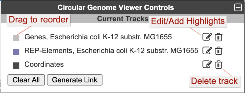
Once one or more tracks have been created, the Current Tracks panel will list all tracks in order from outermost to innermost. Use the edit icon to the right of each track listing to open the Edit Track panel and add highlights or edit other parameters for the track, as described below. The trashcan icon lets you delete a track. The color block to the left of the track label is a draggable handle to enable reordering tracks.
When an edit icon is clicked on, the Add Track panel will be replaced by the Edit Track panel for the selected track. The Edit Track panel supports changing several track display parameters, as well as adding or removing highlights. You can change the track label, update the default feature color, and add a background color. The width and the radius options control the width of the track relative to the overall diagram (since the diagram is arbitrarily zoomable, these numbers are relative to each other, rather than absolute sizes). The radius refers to the radius of the outermost track in the diagram. Changing this will change the relative widths of all tracks. The width refers to the width (not the radius) of just the specified track.

Highlight operations enable coloring of data elements within a track and can be added to an existing track one at a time by entering highlight criteria and clicking Apply Changes. For example, given a track containing all promoters, those promoters recognized by a specified sigma factor can be highlighted in red. Highlights cannot be edited, but they can be removed. If a feature matches multiple highlight criteria, it is arbitrary which highlight color will take precedence. Highlights can be applied either to just the selected track or to all applicable tracks (i.e. if there are multiple gene tracks, then when this option is selected a highlight by substring will highlight the matching genes across all gene tracks). Click Done Editing to exit the Edit Track panel and restore the Add Track panel.
Comparative Operations. A circular genome display can contain tracks from multiple organisms or strains for comparative purposes. For example, you could begin with a track showing all genes in one organism. Then click the edit icon to the right of the organism name in the control panel and select a second organism, and add all of its genes as second track. Repeat for as many organisms as you wish.
As you add each track of genes for a new organism, you can request highlighting of orthologs shared between that organism and another organism whose genes track is already visible. While creating a track, the highlight option Orthologs to other organism(s) will highlight all genes in the selected track that have orthologs in any of the other selected organisms. If the Apply highlight to all applicable tracks option is checked, then this will also highlight all genes in the other tracks that have orthologs to genes in the current track’s organism. In addition, when applying one of the other highlighting options, such as genes matching a substring, across all applicable tracks, there are now two possible interpretations for how that highlight can be applied to other organisms: 1) genes whose names in the other organism match the substring should be highlighted, or 2) genes in the other organism that are orthologs to genes that match the substring in the current organism should be highlighted. You can choose which of these interpretations to apply. The latter interpretation is particularly useful in the case where one organism database contains higher quality annotations and data (e.g. transcription factor data or GO annotations) than the others, or when uploading a file of accessions from one organism.
When creating a track from an uploaded GFF file, a feature will be created for every line in the file (unless a filter option is applied). If a set of features uploaded from a GFF file includes scores, those scores can be visualized by color, by bar height, or both. The color scheme is computed automatically from the feature set, and the only possible customization is to set a maximum score cutoff for the highest color and height bin. If highlights are applied, they will supersede the score-based color. The figure below includes data from an uploaded GFF file with scores displayed by both color and height, with one feature type highlighted in purple. Note that GFF file uploads are limited to files of no more than 10,000 features and 1MB in size.
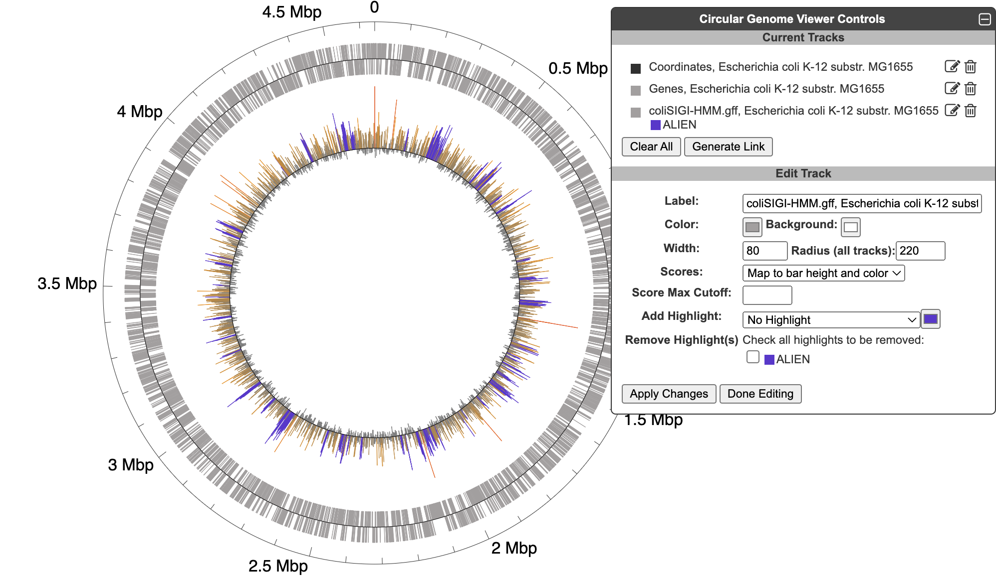
6 Older Genome Browser
The genome browser can be used to examine one replicon (chromosome or plasmid) at a time. Its tracks capability can be used to visualize high-throughput datasets in a genome context.
The genome browser can be invoked by
Selecting Genome → Genome Browser from the main menu
Clicking on a replicon listed in the organism summary page (that page can be created by selecting Analysis → Summary Statistics
Clicking on the “Genome Browser” button in gene pages, on the Map Position line
At the top of the genome-browser page, the full length of the chromosome is shown at low resolution. A region of the chromosome can be selected for display at much higher magnification in the lower part of the screen. The selected region will be drawn using as many lines as will comfortably fit on the Web browser page. The full chromosome view at the very top indicates the magnified region by means of a red, rectangular cursor.
Selection of the magnified region can be achieved by the following methods:
Clicking on a vertical tick mark within the full chromosome line at the top will show the immediate neighborhood of that position. The tick marks in the magnified region can also be clicked on, to recenter the region around the selected tick mark quickly.
Start and end base-pair positions can be entered in the corresponding text entry boxes; clicking the Go button displays that region.
The region around a gene can be shown by entering the gene name in the corresponding text entry box and clicking on the Go button. The selected gene will be visually highlighted.
The panel of navigation arrows to the left of the legend can be used for moving to a nearby region. The panel allows lateral translation to the left or right, and also serves to zoom in or out.
The magnified section indicates the transcription direction of genes by rectangular blocks with an arrow at one end, pointing from the 5’ to the 3’ end. ORFs for actual or inferred proteins have symmetrical arrowheads (with the arrow apex in the center), whereas RNA genes have an asymmetrical arrowhead (with the apex at the top edge). Phantom- and pseudo-genes are crossed out with a big, diagonal X. When a gene wraps across more than one line, a zigzag at the end of the line indicates that the gene continues on the next line. Clicking on a gene brings up the corresponding gene description page.
Gene arrows filled with solid colors have transcription unit (operon) information available. All the adjacent genes that are part of a given operon are assigned the same color. Genes that have not been assigned to any transcription unit are not colored. Additionally, transcription-units are indicated by a gray background area behind the genes, spanning the entire region of the operon.
Moving the mouse-cursor over the genes reveals their product name and the length in base pairs of the intergenic region between the chosen gene and its neighboring genes to the left and right. If the number of base pairs carries a minus sign, the genes overlap by that many bases. As an example:
Gene: xdhB Product: putative xanthine dehydrogenase subunit, FAD-binding domain Intergenic distances (bp): xdhA< +11 xdhB -3 >xdhC
This means that there are 11 bp to the left of xdhB before xdhA is reached, but to the right, xdhC overlaps with xdhB by 3 bp.
If the overlap between adjacent genes is more than a small amount, the shorter gene is drawn above the longer gene to avoid visual clashes.
When zooming in to a great level of detail, transcription start sites and terminators are drawn. Transcription start sites are indicated by small arrows that point toward the 3’ end of the transcript. Moving the mouse-cursor over a transcription start site reveals the operon it is part of. The transcription factors controlling the operon are also shown, with a plus sign meaning activation and a minus sign meaning inhibition. Clicking on a transcription start site brings up the corresponding transcription unit description page.
6.1 Older Genome Browser: Tracks Mode
External datasets can be shown alongside the display of a replicon region, in form of additional tracks that are uploaded by the user. The supported tracks file format is GFF, version 2. A short description of this format can be found on the help page, reached by clicking on the green icon containing a question mark, on the far right side of the genome browser’s navigational controls.
The GFF file allows definition of segments on the chromosome that are denoted by a start and stop base-pair position. In an attribute field of the file, a name can be assigned to the segment, and in a score field, a numerical value (such as an expression value) can be supplied. This allows a broad range of different data types to be shown in the genome browser, aligned with the genes and transcription units that a PGDB already describes. This could include alternate gene predictions, or the results of expression experiments. Each specified segment can state a source and feature value, allowing different segment types to be supplied in one file. The external track mode of the genome browser will display different combinations of source/feature values grouped together. If in these groups some of the shown segments overlap due to their base-pair positions, such horizontal segments will be displayed on separate lines, to avoid visual clashes.
To view data from such a GFF file in an external track, first open the genome browser. Next click the “Show Tracks” button to the right of the gene name dialog box. This will enter the external tracks mode, in which the magnified genome region will no longer wrap to fill the screen, instead making room for external tracks that will be displayed underneath. Vertical hair lines will be shown for easier visual alignment of features in external tracks with the magnified region. Next, add tracks data from an external data file using the controls at the bottom of the page. The data file can be specified through a Web site URL (click the “Add Track” button to the right of “Load track data from GFF file via URL”), or from a file on your computer’s hard disk (click “Browse...” to find the file, then click its associated “Add Track” button). Depending upon the size of your GFF file, it can take several minutes to upload a file. During this time, the page will not respond, and you should not click more controls. After the file has finished successfully uploading and being parsed, it will let you know by refreshing the page.
The external tracks display will show the feature name on the left, the sequence name if one is included, and the appropriate color to match the feature’s score, if a score value was found in the GFF file. Following the display of a track, you can continue to browse the genome normally, using the standard Left, Right, Zoom Out, and Zoom In controls, and the Gene Name box.
You can display data from more than one GFF file at the same time. Load each file individually using the procedure described above. Tracks from the first file loaded will appear just below the gene line. Tracks from the second file loaded will appear below those from the first, and so on. The order of the tracks can be changed, by left-clicking on the underlined track titles on the left side, which name the feature type. The popup menu allows the chosen track to be moved up or down by one step relative to the current ordering.
The horizontal bars represent the feature data found in the GFF track file. These are arranged in rows distributed vertically, so as to help prevent overlapping features from running into each other and being indistinguishable. The number of distributed rows may vary with the zoom scale, so that features can fit; there is no other meaning to the number of lines. The length of each horizontal bar shows the extent of each individual feature reading. The color is drawn from a spectrum that shows the magnitude of a score. In order to get a better feel for this magnitude, a graph of the same track feature data is also plotted above the horizontal bars. In the default graph mode, each feature score is represented by a horizontal line spanning the feature’s start and end base-pair coordinates. The magnitude of the score is represented as the height on the graph. This offers an intuitive method of viewing trends and anomalies in the data at a glance.
In the bar graph mode, the rectangular area between the feature’s horizontal line and the baseline (corresponding to a score of zero) is filled by a solid color. This is useful for features that tend to be very short, which may otherwise be hard to see.
It is possible to choose to display, or turn off the display, of either the horizontal bars or the graph plot or both, for each of multiple tracks viewed simultaneously. Reference a pull-down selector control next to the listing of the track at the bottom of the page, which switches between “Show both graph and horizontal”, “Show both bar graph and horizontal”, “Show only graph”, “Show only bar graph”, “Show only horizontal”, and “Both invisible”. This control allows you to stack graphs from different tracks close to each other, so that you can compare them and see fine differences between them.
It is also possible to shift the plotted range of this graph for each track file viewed. Beside the listing of the track there is also a line saying “graph Y range from [ ] to [ ]” with a “Set” button. Fill in the desired lower and upper Y coordinates of the range, press the “Set” button, and that particular graph will be redisplayed with that setting. Entries may be in integers or decimals. The lower range must be less than the upper range coordinate. Score values that fall outside the range will result in the display of a horizontal line just a little bit outside the graph range, to visually indicate this over- or underflow condition.
In graph mode, the entire track is assigned a color from a predefined set of colors. However, it is possible for the user to choose the color of a track, by adding a new header comment line close to the top of the GFF file, before uploading the file. An example line looks like this:
##color green
Several common color names can be substituted for "green".
6.2 Older Genome Browser: Comparative Mode
The comparative genome browser can be used to examine several replicons (chromosomes or plasmids) simultaneously, side by side. This view facilitates comparison of related organisms to observe similarities and differences in their gene arrangements. For the alignment to work, ortholog links must exist among genes of the organisms to be compared. The comparative genome browser is usually entered from a page describing a gene. To invoke it, select Align in Multi-Genome Browser from the operations box on the right side of the page. You will first be asked to specify the organisms whose genome regions you wish to compare. The selected set of organisms is remembered for some time by the Web browser. If you wish to change them, use the command Change organisms/databases for comparison operations.
When the comparative genome browser is invoked from a gene page, that gene and its organism orchestrate the rest of the alignment. In the display, the top-most replicon is the reference, against which the comparisons are made by following the ortholog links for every gene of the top replicon in its visible section. The selected gene that is the focus of the comparison is highlighted on each replicon by a thick outline and a slanted hashed background. These selected genes are lined up at the center position of their lengths. The magnified region can be adjusted by the following methods:
An alignment for a new gene can be displayed by entering the gene name in the gene entry box, then clicking the “Go” button.
The panel of navigation arrows can be used to translate the view left or right, and to zoom in and out.
Genes with solid colors have links to orthologs. Corresponding orthologs are assigned the same color, out of a set of a dozen colors that will be reused repeatedly. Genes for which no ortholog links were found in the PGDB are not colored. The other display features are the same as described for the regular genome browser.
7 SmartTables
A SmartTable is a collection of PGDB objects, such as genes or pathways, together with associated data, that can be displayed in tabular form. SmartTables (formerly called “Web Groups”) allow you to store experimental results (e.g., a set of genes of interest from an experimental study), analyze those results (e.g., perform an enrichment analysis to learn if those genes share common biological processes, or paint those genes into a metabolic map diagram), and share SmartTables with colleagues. SmartTables can be created from tabular data files, and from query results, and SmartTables can be exported to files. A variety of other operations can be performed on SmartTables, such as filtering and set operations. Example transformations include:
Transform a gene SmartTable to a SmartTable of pathways in which the genes participate
Transform a SmartTable of genes to a SmartTable of promoters, or transcription binding sites, or transcriptional regulators, that control those genes
Transform a SmartTable of pathways to a SmartTable of metabolites that are substrates in the pathway
SmartTables support a number of analysis operations including painting omics data onto a zoomable metabolic network diagram, and viewing multiple-sequence alignments of a set of genes or proteins
Web SmartTables are stored in a user’s web account, so to create SmartTables you must have an account and be logged in. Users who aren’t logged in can view and download SmartTables that others have made public. A SmartTable has a persistent URL, so they can be used as a data publishing and sharing platform. SmartTables can be private, public, or shared with a defined set of users.
Firefox and Chrome are the recommended browsers to use with SmartTables. Other browsers will usually work but have not been as thoroughly tested with SmartTables and thus minor issues may arise. Use of Internet Explorer is discouraged, but, for the most part, will work as well.
A number of SmartTables operations can also be invoked via web services.
7.1 SmartTable Structure and Display
Some terminology: A SmartTable consists of a set of rows and columns. A cell is the intersection of a row and a column, and can contain one or more values, which may be Pathway Tools objects (such as genes or pathways), numbers, or text strings.
A SmartTable is displayed on its own web page (see the figure below). The URL of this page is persistent and may be bookmarked or shared. At the top of this page are some metadata about the SmartTable, such as its title and a textual description (these can both be edited by clicking on them). Information about the SmartTable’s contents and sharing status is also displayed.
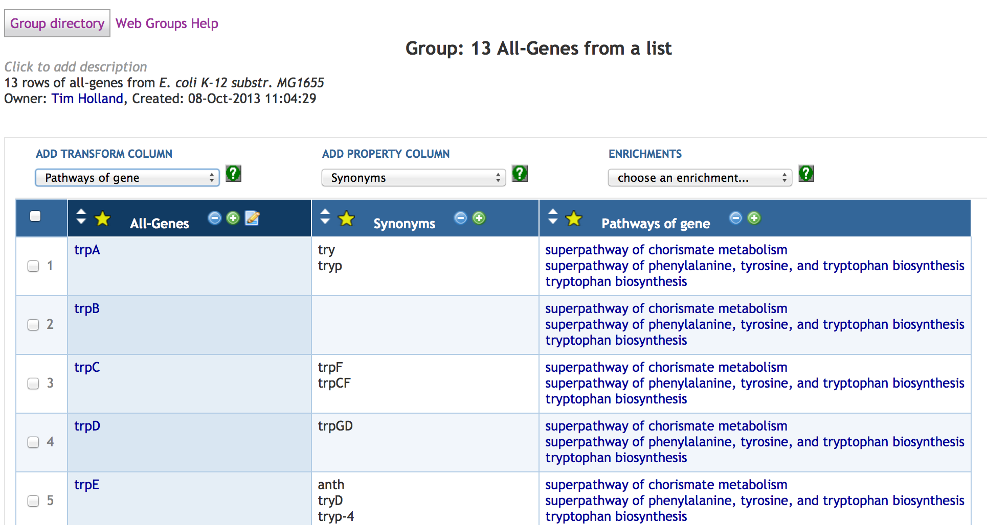
In this example, we started with a SmartTable of genes (the column heading is All-Genes, in the first column after the checkboxes), and added some properties.
Typically the first column of a SmartTable will be a set of PGDB objects (e.g., a set of genes from a search or from an experimental result) and other columns will be properties or other values derived from the first column (e.g., the products of the genes in the first column). The blue column headings are clickable and can be used to select individual columns for certain operations. A SmartTable must always contain at least one column.
If a SmartTable has more rows than will fit on a page, paging controls will be displayed above the column headings and at the bottom of the page. Also present is a control to set the number of rows per page. All rows can also be displayed on one page.
The checkboxes on the left are used to select subsets of the SmartTable’s rows for deleting or copying to a new SmartTable. Note that checkboxes work properly over multiple pages — that is, some rows can be checked, a new page can be navigated to and check some more, and the ones on the first page will still be considered checked. Checking/unchecking the checkbox in the header will check or uncheck all rows in the SmartTable (not just the ones on the current page). This checkbox behavior also applies to any lists of SmartTables.
7.2 SmartTable Directory
The SmartTable directory page provides a list of the SmartTables that are accessible to you. It may be accessed via any of the items under the SmartTables menu, such as My SmartTables. The directory is composed of several tabs:
My SmartTables — a list of SmartTables you own
All SmartTables — a list of all SmartTables that are accessible to you (such as SmartTables that have been shared with you)
Public SmartTables — a list of all public SmartTables (note that these are also included in the All SmartTables tab)
Special SmartTables — a list of computed SmartTables, such as a SmartTable containing all genes in the currently selected organism
By default the SmartTable directory lists most recently changed SmartTables first, but it can be resorted using the sort arrows in column headings.
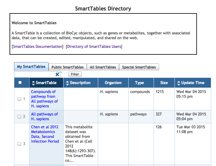
7.3 Creating a SmartTable
There are a number of ways to create a SmartTable, such as from search results and from files. If you are logged-in to the PGDB website, every SmartTable you create will be saved automatically as you modify it. If you are not logged in then the SmartTables you create will not be saved, they will be temporary.
7.3.1 Creating a SmartTable From a Search
The results of web searches (e.g., from the Search → Search compounds page) can be converted to a SmartTable by means of the “Turn into a SmartTable” button.
7.3.2 Creating a SmartTable Manually
An empty SmartTable can be created and filled in by hand. To do this:
Go to the SmartTables directory page (SmartTables → My SmartTables)
Select the New → Empty SmartTable action from the operations menu on the right. This creates a SmartTable with a single column and no rows.
Add a row by clicking the “Add row” link at the bottom of the display.
The row has an autocompleting text field. Enter an object name (e.g., a gene or metabolite name) and hit Enter.
Repeat steps 3 and 4 for the rest of the SmartTable.
7.3.3 Creating a SmartTable Via Tab-Separated File Import
A SmartTable can be created by importing a text file in tab-separated value (CSV) format. Each row and column in the imported file becomes a row or column in the created SmartTable. The first column must contain the name or identifier (accession number) of an object in the database (e.g., a gene name or metabolite identifier) if that row is to be recognized as that object. Typically all rows in the file are for the same type of object (genes versus metabolites), but it is possible to mix object types within a SmartTable.
Go to the SmartTable directory page.
Select the New → SmartTable from Uploaded File… action from the operations menu on the right.
A panel will appear that will prompt for a file to be selected and uploaded.
If “Try to make objects” is selected in the upload menu, SmartTables will try to recognize each value in the first column as a PGDB object such as a gene; otherwise values in uploaded files are initially just text strings. To turn them into recognized database objects (e.g., genes) after importing, select the appropriate column by clicking in the column header and use the Column → Set Type… action.

7.3.4 Creating a SmartTable Containing Chromosomal Regions and Sequence Variation Data
A SmartTable can be created by importing a text file that specifies the coordinates of replicon regions, and associated sequence variants, in a tab-separated file format. A special transformation supports further analysis and interpretation of sequence-variant data — see Section 7.4.2
To import from a file of replicon coordinates, do the following:
Select the organism with which the SmartTable will be associated.
Go to the SmartTable directory page via SmartTables → My SmartTables
Select the New → SmartTable from Replicon Coordinates… action from the operations menu on the right.
A panel will appear that will prompt for a file to be specified and uploaded.
The input file format is as follows (an example file is available at http://brg.ai.sri.com/ptools/replicon-coords.dat):
Column 1: replicon name (as listed in organism summary) – defaults to first replicon stored in PGDB, invalid/blank value uses default
Column 2: region start coordinate
Column 3 (optional): region end coordinate — defaults to start
Column 4 (optional): nucleotide letter(s) for the substitution at this region
Column 5 (optional): comment describing the region
Replicons can be specified in the file by either frame name or common name. Nucleotide coordinates for the start and end positions are relative to the replicon specified. If only either a start position, or only an end position is given, it defines a single-nucleotide region. Any invalid data may result in a row containing “NIL” and the row may have other unexpected results.
The resulting SmartTable will contain either one or two columns — the first column will contain the specified regions; the second column will contain region comments, if supplied; see example below. Clicking on a cell in the first column will open the genome browser around that region.
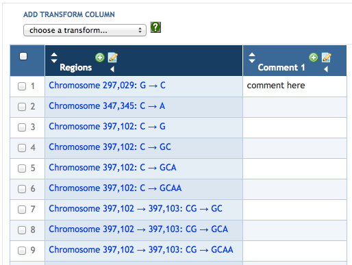
7.3.5 Creating a SmartTable From an Existing SmartTable
There are a number of ways to create new SmartTables from existing SmartTables. A SmartTable can be copied via the New → Copy of this SmartTable action. Additionally, if the SmartTable can only be viewed but not edited, such as “Special SmartTables”, a message will appear prompting the user to create a writable copy of the SmartTable.
A column of a SmartTable can have its contents turned into a new SmartTable, by clicking the + icon that appears in column headings, or by selecting a column by clicking in the column header and then using the New → SmartTable from Column action (these are equivalent operations).
Rows of a SmartTable can be used to create a new SmartTable that shares the same column headings by selecting the desired rows using the checkboxes at the beginning of each row, then using the New → SmartTable from Selected Rows action.
See also the Filtering operation which has the option of creating a new SmartTable based on a filtered subset of rows from an existing SmartTable.
7.4 Adding SmartTable Columns
SmartTables can be manipulated in a number of ways, both at a fine level of granularity (such as editing individual cells), and by applying transformations to an entire SmartTable. The most common situation is to add one or more columns. Usually new columns will be derived from the database objects listed in the first column of the SmartTable. However, you can select a different column (by clicking in the column header), in which case the Add Column selector will list available properties for that currently selected column.

Many of the listed properties are stored in the database for that type of object (e.g., for genes, the property Left-End-Position is stored in the database). Frequently used properties include (for all types of objects) Object ID (the identifier or accession number), Comment, Citations, and Creation-Date; (for genes) Product, Right-End-Position (sequence coordinate), and Accession-1. The ability to create a property column or an enrichment column from another property column may not be available.
Others properties are computed dyamically by the website. Depending on the type of objects contained within the selected column, different computed properties (also called transformations) will be available, i.e., different transformations are available for genes than for metabolites. Example transformations include: transforming a column of genes to their upstream binding sites, to their promoters, to their Gene Ontology terms, to their orthologous genes within another PGDB, or to the set of genes regulated by those genes; transforming a column of pathways to the genes within the pathways, to the metabolites within the pathways, or to the reactions within the pathways. The following subsections present transformations on metabolites, and a transformation for analyzing sequence variant information.
The column selector does not make any distinction between property and transformation columns — you can select any combination from the set of options provided (which will depend on the type of data in the selected column).
7.4.1 Converting a Column to a New SmartTable
Consider the “Pathways of compound” transformation available for compounds. It will generate a new column where each cell in the new column contains the set of metabolic pathways in which the compound in the selected cell in the same row occurs. Imagine that we want to create a new SmartTable consisting of all pathways in that new column, that is, to create a new SmartTable consisting of the result of the preceding transformation. We can do so by clicking the “+” at the top of the column containing the pathways. That operation will create a new SmartTable with two columns: Column 1 contains a non-duplicative list of all pathways in the preceding column; Column 2 lists the metabolites from Column 1 of the previous SmartTable that are present in each pathway.
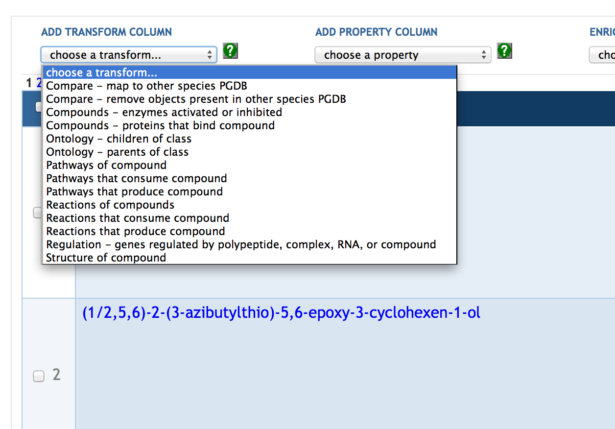
7.4.2 Transformations on Chromosomal Regions Containing Sequence-Variant Information
This transformation takes as its starting point a SmartTable of genome regions and sequence substitutions within those regions that were loaded from an input file, as described in Section 7.3.4. Those regions and substitutions are listed in Column 1 of the SmartTable below; Column 2 contains an optional comment for each region from the input file. The transformation “Sequence – nearest gene to DNA region” adds several new computed columns to such a SmartTable, shown here:
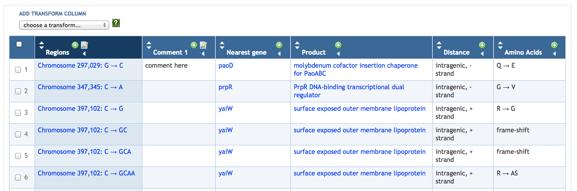
Column 3 lists the gene whose coding region is nearest to the DNA region in the first column and Column 4 lists the name of that gene’s product.
Columns 5 and 6: If the coding region of the nearest gene overlaps the DNA region in the first column, then Column 5 says “intragenic” followed by the DNA strand from which the gene is transcribed; Column 6 lists the amino-acid change caused by the substitution at the given region (the column is empty for RNA-coding genes). If the coding region of the nearest gene does not overlap the region in the first column, Column 5 states the distance from the region in the first column to the coding region of the nearest gene, and Column 6 is blank.
A natural next analysis step is to click on the top of the Nearest Gene column and then perform an enrichment analysis (described in the next section) to determine what these genes have in common.
7.5 Other SmartTable Manipulations
7.5.1 Adding an Empty Column
Columns can be added to a SmartTable from the Column → Add Column right-menu action (which creates an empty editable column), or by using the transform and property selectors (see below).
7.5.2 Editing a Column
Editable columns (which are those that are not defined by a transform or other computation) can be edited by clicking the edit icon in the column header. This changes the cells to editable fields. Clicking the icon a second time will turn off editing for that column.
7.5.3 Adding Rows
A single row can be added to a SmartTable by means of the link at the bottom of a SmartTable, or using the Rows → Add Row action (they are equivalent). Any editable cells in the new row are displayed in edit mode, so values can be entered.
Additionally, certain object pages, such as those for a gene or protein, have an “Add to SmartTable” button, which places the object in an existing SmartTable.
You can add multiple rows and/or columns of data to an existing SmartTable using the command Extend SmartTable by Uploading File.... The command itself provides extensive instructions. But in brief, the import file should be tab-delimited. To add new rows, the file should contain a set of rows where the first column of each row lists an object name or identifier that is not already in the SmartTable. To add new columns, the file should contain a set of rows where the first column of each row lists an object that is already in the SmartTable.
7.5.4 Deleting Rows
Rows can be deleted by selecting them using the checkboxes on the left of the display, then choosing the Rows → Delete Checked Rows action.
7.5.5 Moving and Deleting Columns
Columns can be rearranged with the Column → Move … menu items. They can be deleted with the Column → Delete Column menu item. These operations apply to the selected column. A column can also be deleted by clicking on the “–” icon in the column header. This icon will not be present if deleting the column is not currently a valid action, such as when the SmartTable has only one column.
7.5.6 Sorting
SmartTables can be resorted on the values of any column by means of the sorting controls (triangles) in column headers.
7.5.7 Filtering
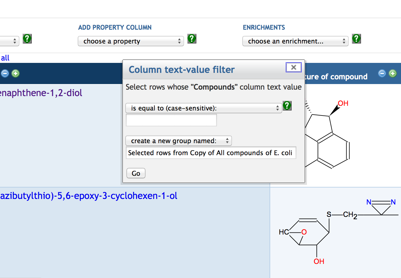
Filtering means operating on a subset of rows from a SmartTable according to some criterion. For example, you might delete all rows of a SmartTable in which a column value (such as a molecular weight) is less than some supplied value. More generally, with filtering you can keep or delete rows from the current SmartTable, or from a copy of that SmartTable, according to specified criteria.
The filter menu context will differ between column types. For example, numeric columns will be given options to specify a value range condition, such as greater than, equal to, less than, and so on. Likewise, string columns have options to filter based on various substring conditions. To filter, select the desired column and choose the Filter action. A dialog appears that allows for selection based on the filtering criterion.
The filter can either modify the SmartTable in place or create a new SmartTable with a specified name. In either case, if the resulting SmartTable is empty, an error is displayed instead of completing the operation.
7.5.8 Column Set Type
The values in cells have a type, which may be either a PGDB object (e.g., a gene), a text string, or a number. Generally values in a single column will all be of the same type, but this is not required. The type can be controlled by means of the Column → Set Type… action. In general this is used after importing data from a file, to turn string values into PGDB objects.
7.5.9 Set Operations
Under the Set Operations… action, various set operations based on set theory, such as union, intersection, and difference, can be performed between the current SmartTable and a second SmartTable. A new SmartTable can be created or the current SmartTable can be modified in-place. For example, these operations can compute the intersection (items common to both) of two SmartTables.
The set operations are performed on a row basis, for example, a set-difference operation removes from the first SmartTable those rows that it shares in common with a second SmartTable. When we say in common we mean that columns selected for each of the two SmartTables share the same value. For example, in the simplest case we have two SmartTables that each contain a list of genes, each in a single column. Then the set difference would compute those genes in the first SmartTable that are not present in the second SmartTable.
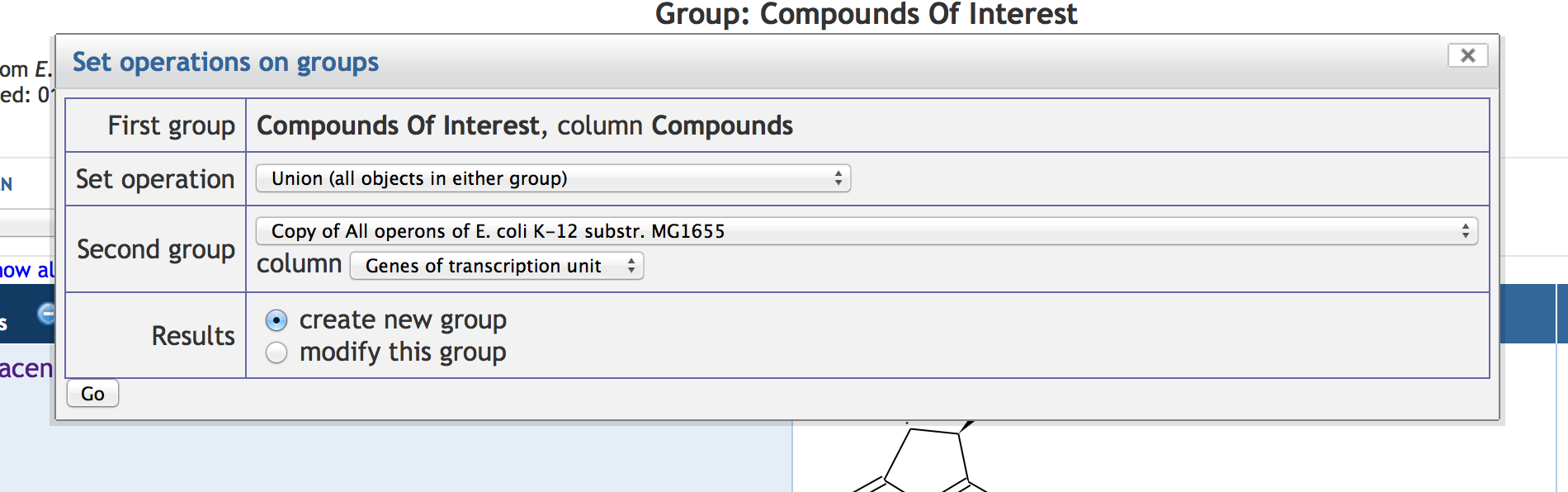
7.6 SmartTable Analysis Operations
Here we describe several analysis operations enabled by SmartTables. In addition see the tool for painting data onto the Cellular Overview metabolic map diagram (Section 7.8.4.
7.6.1 Enrichment Analysis of SmartTables
Enrichment analysis is a computational technique for identifying known categories of objects (e.g., pathways) that are statistically over-represented in a set of objects (e.g., genes that are significantly up-regulated in an expression experiment). For example, enrichment analysis allows us to ask whether a set of genes contains more genes within a metabolic pathway than one would expect to occur by chance, or more genes regulated by a given transcriptional regulator than one would expect to occur by chance, or more metabolites in a given metabolic pathway than one would expect to occur by chance.
BioCyc computes enrichment using the Fisher exact test implemented using the hypergeometric distribution (we do not use the GSEA method). The reference gene set used for the enrichment analysis depends on the enrichment options selected. For pathway enrichment, the reference gene set is the set of all genes assigned to any metabolic pathway in that organism. For GO term enrichment, the reference gene set is the set of genes that have products with assigned GO Terms. Enrichment analysis can be invoked on a SmartTable of objects in a SmartTable by:
Selecting the column to be operated on (such as a column of genes or a column of compounds)
Choosing an item from the Enrichments selector and clicking the button
Choosing parameters from the dialog
The enrichments selector offers a list of enrichment analysis options appropriate to the currently selected column in the SmartTable. The options will be of the form ’X Enriched for Y’ where X is the type of object in the selected column (genes, metabolites, etc.) and Y is a biological term (pathways, GO terms, transcription regulators, etc.) that is arranged in an ontology hierarchy within the PGDB. Note that a biological term will either be an ontology class or an individual that “includes” several of the object in question. For example a pathway may include enzymes from several genes and a regulator may regulate more than one gene. Once you have selected the appropriate term you want to test for over (or under) representation, you will see the enrichment parameters dialog appear.
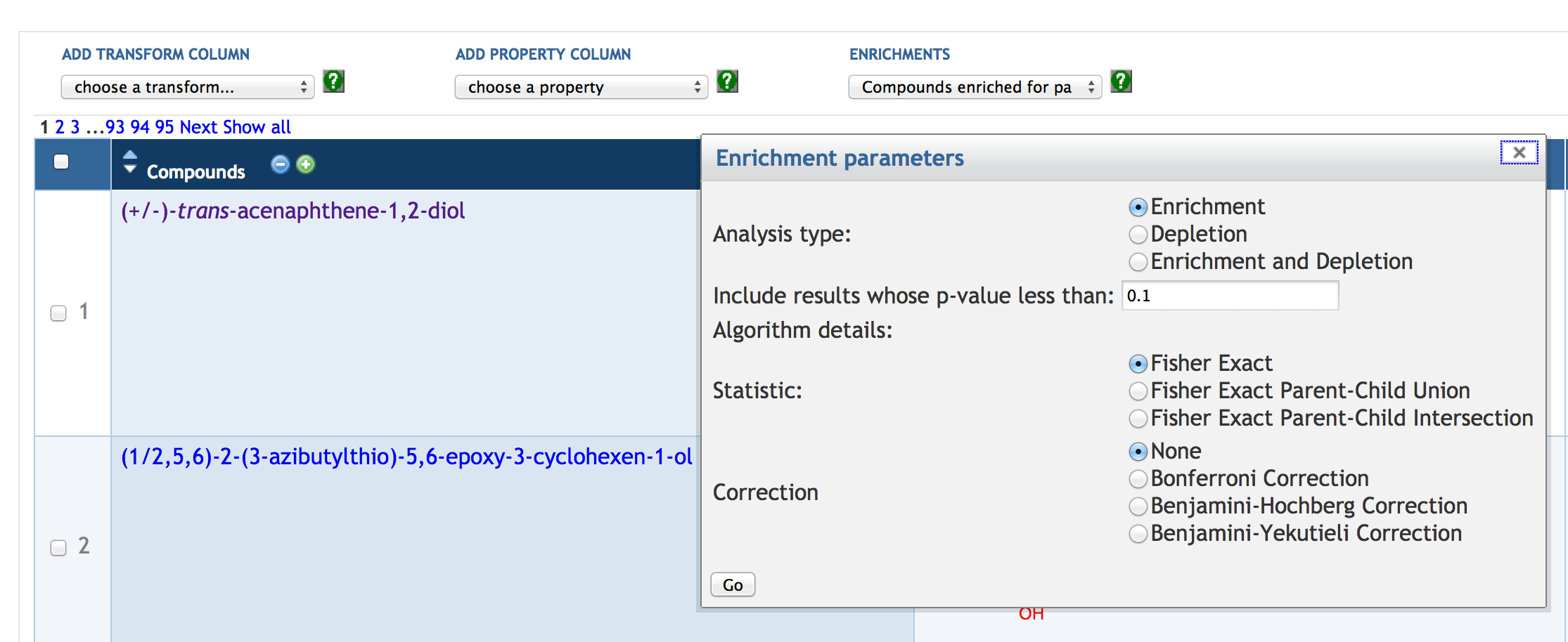
The enrichment parameters dialog specifies several things. First is whether to look for over representation (Enrichment), under representation (Depletion) or either. The next box specifies a cut-off p-value. Although 0.05 is traditional for hypothesis testing, enrichment analysis is more exploratory than the test of a specific hypothesis, so a somewhat higher value (e.g., 0.1) is commonly used. There are three statistical options, though all are based on the Hypergeometric or equivalent Fisher Exact test. The second and third options control the “background” set for the enrichment/depletion test. The background is either the entire set of terms of the selected type (e.g., pathways) or those associated with the parent of the term under consideration. The choice of union or intersection is relevant if a term has multiple parents.
The correction box specifies a correction for multiple comparisons. Because there are hundreds or thousands of tests performed in an enrichment analysis, it would be expected that some tests would result in a significant p-value strictly by chance. Corrections adjust the p-value you selected to adjust for this. The Bonferroni correction was designed for hypothesis testing and is therefore likely to be too conservative for exploratory analysis. The Benjamini-Hochberg correction controls what is called the “False Discovery Rate” and is considered more appropriate for exploratory analysis. The Benjamini-Yekuieli correction corrects for certain sorts of non-independence in the input data and is somewhat more conservative than Benjamini-Hochberg. Benjamini-Hochberg is appropriate for most or all cases. Note that these corrections do not change the relative ordering of the results computed, only whether individual results fall above or below the p-value cutoff.
Please see the Pathway Tools Users Manual for more information on enrichment, including more detailed description of the statistics and correction options.
The enrichment operation always creates a new SmartTable, which contains three columns: the enriched objects (e.g., pathways), the p-value, and the matched objects from the original SmartTable (e.g., genes). The new SmartTable will be sorted by p-value, lowest (most significant matches) first.
For pathway or GO term enrichment analyses, the resulting SmartTable can be mapped onto an ontology view, to see how the most highly enriched terms are related to each other. Select Paint Data → on Ontology Viewer from the right operations menu. By default, all terms in the SmartTable are included in the diagram; set a score threshold to filter out lower scoring terms (scores are computed as −log10(p−value)).

7.6.2 Invoking Multiple Sequence Alignments with SmartTables
From a SmartTable containing a column of genes in the first column or any other column, you can view a multiple sequence alignment for those genes or their products as follows. Select the column of genes, and then run the action Column → View Alignment of Gene Nucleotide Sequences or Column → View Alignment of Gene Product Peptide Sequences. The resulting alignment is computed by MSA Viewer.
7.6.3 Email Notification of Database Updates
The BioCyc Update Notification system enables users to designate pathways or genes of interest to them; subsequently, BioCyc will send a personalized notification email when a new BioCyc release includes updated curation for any of the objects a user has requested notifications for. You can register for update notifications for a set of objects by adding those objects to a SmartTable, selecting the relevant column, and running Get email notification of updates to genes or pathways in this column.
You can further manage your update notifications via the command Tools → Analysis → Update Notifications.
7.7 Exporting and Sharing a SmartTable
Once a SmartTable is defined, there are a few things that can be done with it (other than browse it on the web). The SmartTable can be exported in a variety of ways or shared with others.
7.8 Publishing a SmartTable
To create a permanent record of a SmartTable, such as to refer to the SmartTable from a publication, select the SmartTable of interest and run Create Frozen Copy... The command will create a new copy of the starting SmartTable that is readable by the public and that cannot be modified. It can be deleted from your SmartTables directory.
7.8.1 Export to a Spreadsheet File
SmartTables can be exported to tab-separated value format files using the SmartTables → Export → to Spreadsheet File … menu command. When selected, the option is given whether to export the frame names of objects stored in the SmartTable or to use the common name of the objects. Keep in mind that, generally, it’s easier to re-import data by using frame names in the generated file, but the file will also be more difficult to read.
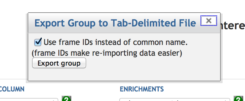
7.8.2 Export to a FASTA File
SmartTables with a gene column can be exported to FASTA format files using the Export → to FASTA File… action. The sequences used will be the currently selected column and the names used will be a string representation of the values in the first column.
7.8.3 Export to a SDF File
SmartTables containing chemical compounds can be exported to SDF (Structure Data File) format files using the Export → Export to SDF… action. The resulting SDF file contains the chemical structures of the exported compounds.
7.8.4 Paint Data (on Cellular Overview)
Objects of the appropriate types (any types that have frame representations in the current PGDB, such as compounds, reactions, or genes) can be displayed over the cellular overview using the Paint Data → On Cellular Overview command. Be sure to select the appropriate column first. If the first column of the SmartTable contains objects (e.g. genes, compounds), and one or more other columns contain numerical data values, then the SmartTable can be displayed on the Cellular Overview Omics Viewer using the command Paint Data → On Cellular Overview Omics Viewer. You will be asked to select the data columns you wish to display, and to specify what kinds of values they are (e.g. absolute or relative, log or linear). Another way to paint data from a SmartTable on the Cellular Overview is to navigate to the desired overview and use the command Overlay Experimental Data → From SmartTable.
7.8.5 Sharing a SmartTable
By default, SmartTables are readable and writable only by their creator. Access can be granted to other users by means of the Sharing dialog, available via the Sharing… command.
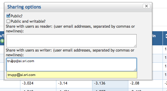
Access by the general public is controlled by the first two checkboxes. “Public?” means that anyone can view the contents of the SmartTable; “Public and writable?” means that anyone can view and edit the contents of the SmartTable (editing is restricted to logged-in users).
Access can also be controlled on a per-user level using the “Share with users” boxes, which accept email addresses of users who have accounts on the website.
7.9 Browsing SmartTables and Users
7.9.1 User Pages and Directory
As part of SmartTables, an enhanced public user page has been created, which can be accessed by clicking on any user name in the SmartTable directory (try the Public SmartTables tab). A user page displays the user’s name, an optional user-settable graphic picture, and a list of the user’s public SmartTables. There is also a user directory available.
7.9.2 Browsing a SmartTable
Under the Browse this SmartTable command, the current SmartTable can be browsed one row at a time. Depending on the type of data in the SmartTable, various text and image elements will be displayed in a single page for a row. In the upper-left corner of the page, a grey box will be shown that displays the name of the SmartTable being browsed as well as a Next link to move to the next row’s page. The Clear link can be used to stop browsing and stay in the current page.
8 Omics Data Analysis
This Web site offers multiple tools for analysis of gene expression, metabolomics, and other large-scale datasets, including multi-omics data.
The omics data file format accepted by these tools is described in Section 9.3.1.
A number of these capabilities are also available as web services.
Multi-Omics Analysis
The following tools can be used for analysis of combined datasets from multiple high-throughput technologies.
Visualize multi-omics data on Omics Dashboard — Visualize gene multi-omics data as a hierarchically organized set of bar graphs, summarizing results by a variety of biological functional categories, and enabling the user to drill down into specific areas of interest. Up to three different datasets from the same organism can be uploaded simultaneously to the Omics Dashboard. If two datasets are provided, each will have its own y-axis. If three datasets are provided, two of them will share a y-axis, so you may wish to normalize the data before upload.
[To start: Analysis → Omics Dashboard and click the box to supply multiple datasets.]Paint multi-omics data onto metabolic map — Map up to four datasets onto the metabolic-map diagram. Gene-expression, protein-expression, or reaction flux data can be mapped to reaction arrow color or edge thickness; metabolite data can be mapped to node color or size.
[documentation]
[To start: Metabolism → Cellular Overview then Right Operations Menu → Upload Multi-Omics Data from File]
Paint multi-omics data onto Pathway Collage — Generate a user-customizable diagram containing a set of pathways of interest, overlaid with multi-omics data. There are multiple ways to specify the pathways to be included.
[documentation]
[To start: Metabolism → Pathway Collages]Paint multi-omics data onto pathway diagram — Allows visualization of large-scale datasets on individual pathways.
[file format documentation]
[To start: Visit a pathway page, then select Right Operations Menu → Customize or Overlay Omics Data on Pathway Diagram]
In the pop-up window, in addition to customizing which pathway elements appear in the diagram, you may specify a file of Omics data to be displayed. If the file contains multiple types of data, be sure to specify that the items in the first column can be any of genes, proteins compounds, etc.
Gene Expression and Proteomics Analysis
Many of the following tools can accept proteomics as well as gene-expression data.
Paint gene-expression data onto metabolic map — Colors reaction arrows in the metabolic-map diagram with colors indicating gene-expression and/or protein-expression levels. Data can be uploaded from a file, imported from GEO, or imported from a recently visited SmartTable.
[documentation]
[easy examples]
[To start: Metabolism → Cellular Overview then Right Operations Menu → Upload Single Omics Data from File]Table of highly over/under-expressed pathways — When painting a dataset onto the metabolic map, the upload dialogue offers the option of generating a table of the N most highly perturbed pathways. Each pathway is assigned a Pathway Perturbation Score (PPS), which attempts to measure the overall extent to which a pathway is up- or down-regulated, by averaging the level of deviation from zero (in either direction) over all the reactions in the pathway. If multiple data columns are specified, a differential score (DPPS) is computed, which attempts to measure the extent to which a pathway exhibits change between time points.
[documentation]
[To start: Use previous tool but where you are asked to Choose tools for visualization of imported data, make sure the As a table of pathway diagrams option is checked and specify the number of pathways to include in the table.]Paint gene-expression data onto Pathway Collage — Generate a user-customizable diagram containing a set of pathways of interest, overlaid with gene expression data. There are multiple ways to specify the pathways to be included.
[documentation]
[To start: Metabolism → Pathway Collages]Paint gene-expression data onto single pathway diagram.
[file format documentation]
[To start: Visit a pathway page, then select Right Operations Menu → Customize or Overlay Omics Data on Pathway Diagram]
In the pop-up window, in addition to customizing which pathway elements appear in the diagram, you may specify a file of Omics data to be displayed.Analyze gene-expression data using the Omics Dashboard — Visualize gene expression data as a hierarchically organized set of bar graphs, summarizing results by a variety of biological functional categories, and enabling the user to drill down into specific areas of interest.
[To start: Analysis → Omics Dashboard]Paint gene-expression data onto genome map diagram — Colors genes in the genome map with colors indicating gene-expression levels. This tool is not yet available for Web sites, but does function in the desktop version of Pathway Tools.
Enrichment Analysis — Given a SmartTable of genes, determines whether that gene set is statistically over-represented for genes within certain metabolic pathways, or for genes in certain Gene Ontology categories, or for genes that are regulated by shared regulators.
[documentation]
[To start: Visit a SmartTable page]SmartTable Transformations — Given a SmartTable of genes or proteins (e.g., the highly expressed genes from an expression dataset), transform those genes to the set of pathways containing the genes, or to the set of regulators that regulate those genes.
[documentation]
[To start: Visit a SmartTable page]Genome Browser Tracks — Superimpose positional datasets such as ChIP-chip or RNA seq data on genome regions for visual interpretation.
[documentation]
[To start: Genome → Genome Browser then, if not following this direct link, click Show Tracks button.]
Metabolomics Analysis
Monoisotopic mass search — Enables searching of multiple monoisotopic masses against all metabolites in the selected PGDB.
To start: Search → Search Compounds.Paint metabolomics data onto metabolic map — Colors metabolite nodes in the metabolic-map diagram with colors indicating observed metabolite levels. Data can be uploaded from a file, or imported from a recently visited SmartTable.
[documentation]
To start: Metabolism → Cellular Overview then Right Operations Menu → Upload Single Omics Data from File
When uploading a file, be sure to specify that the items in the first column are compound names and/or identifiers.Table of highly perturbed pathways — When painting a dataset onto the metabolic map, the upload dialogue offers the option of generating a table of the N most highly perturbed pathways. Each pathway is assigned a Pathway Perturbation Score (PPS), which attempts to measure the overall extent to which a pathway is up- or down-regulated, by averaging the level of deviation from zero (in either direction) over all the reactions in the pathway. If multiple data columns are specified, a differential score (DPPS) is computed, which attempts to measure the extent to which a pathway exhibits change between time points.
[documentation]
[To start: Use previous tool but where you are asked to Choose tools for visualization of imported data, make sure the As a table of pathway diagrams option is checked and specify the number of pathways to include in the table.]Paint metabolomics data onto Pathway Collage — Generate a user-customizable diagram containing a set of pathways of interest, overlaid with metabolomics data. There are multiple ways to specify the pathways to be included.
[documentation]
[To start: Metabolism → Pathway Collages]Analyze metabolomics data using the Omics Dashboard — Visualize metabolomics data as a hierarchically organized set of bar graphs, summarizing results by a variety of biological functional categories, and enabling the user to drill down into specific areas of interest.
[To start: Analysis → Omics Dashboard]Paint metabolomics data onto single pathway diagram.
[file format documentation]
To start: Visit a pathway page, then select Right Operations Menu → Customize or Overlay Omics Data on Pathway Diagram
In the pop-up window, in addition to customizing which pathway elements appear in the diagram, you may specify a file of metabolomics data to be displayed. Be sure to specify that the items in the first column are compound names and/or identifiers.Metabolite Enrichment Analysis — Given a set of metabolites, determines whether that metabolite set is statistically over-represented for metabolites within certain metabolic pathways.
[documentation]
To start: Visit a SmartTable page.SmartTable Transformations — Given a SmartTable of metabolites (e.g., the highly expressed metabolites from a metabolomics dataset), transform those metabolites to the set of pathways containing the metabolites, or to the set of reactions containing those metabolites.
[documentation]
To start: Visit a SmartTable page.Pathway Covering Analysis — Given a set of metabolites, find one of the smallest set of pathways that include every metabolite as a substrate. [documentation]
To start: Choose Pathway Covering from the Analysis Menu.
Omics Pop-Ups for Cellular Overview
The Cellular Overview enables the user to drill-down to see the data available for specific genes or metabolites. Omics Pop-Ups enable users to see bar charts, X–Y plots, or heat maps of omics data for single genes or metabolites, or for all genes or metabolites within a pathway. The pop-ups can be customized for a publication or to otherwise make them more legible.
First, mouse over a reaction or metabolite in the Cellular Overview and, by selecting the “Keep” button, lock the resulting tooltip in place to create a caption window. Then, to view an omics pop-up for single genes or metabolites, examine the associated caption. The caption pop-up will include an “Omics” button, if there is omics data associated with the selected node. Selecting the “Omics” button transforms the pop-up into a graphic display of the data.
Right-click on a reaction node in a pathway for which there is omics data to expose a menu including the item “Display Omics Data for Every Node in Pathway: <pathway name>”. The graphics will include the omics data for every gene or metabolite in the pathway to which this reaction belongs.
Generating a Table of Most Highly Perturbed Pathways
The tool described in this section make use of a “Pathway Perturbation Score” (PPS). The PPS is meant to capture the activation level of a given pathway at a single point in time. The PPS is computed from the expression levels of the genes or metabolites within each pathway. Note that the PPS differs from the pathway score computed by PathoLogic during pathway prediction; that score captures the likelihood that the pathway is present, as opposed to the pathway activation level captured by the PPS.
The “Differential Pathway Perturbation Score” (DPPS) attempts to capture the degree to which a pathway’s activation level changes across multiple time points, and is computed from multiple values of the PPS for each pathway. You can upload an omics dataset into this website, have the software compute PPS or DPPS scores for each known pathway from those data, and then generate a table depicting each pathway painted with omics data and sorted by the PPS or DPPS scores. You can select how many of the highest-scoring pathways are included in the table. To generate this table, start from the Cellular Overview Diagram (Metabolism → Cellular Overview) for the organism of interest. Use the Upload Data from File command to enter your data file information. By default, the “Show data” option will overlay the data onto the Cellular Overview Diagram. However, you can instead request that the data be shown either “As a table of pathway diagrams” or “Both on this diagram and as a table in a new tab” — either one of these options will cause a table to be generated. You must specify how many pathways should be included in the table.
The Pathway Perturbation Scores and Differential Pathway Perturbation Scores are computed as follows:
PPS: The PPS computes the overall activation level of a pathway from the activation levels of all reactions in the pathway. A Reaction Perturbation Score (RPS) is computed for each reaction as the maximum absolute value of all data values for objects associated with the reaction. For gene expression data, the RPS is computed from all genes coding for enzymes catalyzing the reaction; for metabolomics data, the RPS is computed from all metabolites that are reactants or products within the pathway. If the data values are not already in log format, they are first converted to log values. For example, if a reaction has three associated genes with log gene expression values -1.5, .3 and 1.2, the RPS would be 1.5.
To compute the PPS, we sum the squares of the RPSs for all reactions in the pathway (excluding spontaneous reactions for which no data is available) and divide by the square root of the number of reactions (we use the square of the RPSs instead of the average in order to weight larger RPSs more heavily, and we use the square root of the number of reactions in the denominator in order to weight longer pathways more heavily). For a pathway containing N reactions: PPS = [(RPS12 + RPS22 + ... + RPSN2)]/sqrt(N). DPPS: For multi-column datasets (meaning multiple time points or multiple treatment conditions), the Differential PPS (DPPS) is a single number that measures the extent to which a pathway is perturbed across columns. The DPPS is computed the same way as the PPS, by combining RPS values for each reaction. However, when computing the RPS from the entities (e.g. genes, metabolites) associated with a reaction, the data value we use is not the entity’s expression value for any single column, but rather the difference between its maximum and minimum values across all columns. For example, if a single gene in a three-column series has values .1, 2, -1.5, the value for that gene used in the RPS computation would be (2 - -1.5) = 3.5. The differential RPS (DRPS) is then computed as the maximum of these difference values for all entities associated with the reaction. The DPPS is computed from these DRPS values as above, using DRPS values in place of single-column RPS values, i.e. DPPS = (DRPS12 + DRPS22 + ... + DRPSN2)/sqrt(N). Because PPS measures perturbation in either direction, the DPPS is not a simple difference between PPS values – a pathway can have a high DPPS even if its PPS is relatively similar for each column if either (a) the value for some object swings between a large positive value and a similar magnitude negative value between columns, or (b) if different reactions in the pathway experience their large perturbations in different columns.
Note that for metabolomics datasets, the RPS value for a reaction is the maximum data value for all metabolites (reactants and products) in the reaction. Because side metabolites (those metabolites not shared between adjacent reactions in a pathway) are omitted from the pathway diagrams in the table, and because the colored circles showing metabolite expression levels are shown for main (shared) metabolites only, some data values may not be visible on the diagram.
For multi-omics datasets, the RPS calculation for a reaction will be the maximum of all data values associated with associated with the reaction, whether those are values for a metabolite, gene, protein, or the reaction itself. This is really only useful if all data values are normalized, such that a given value for a metabolite is of roughly equal consequence as that same value for a gene. Otherwise, the RPS and therefore the PPS computations will be distorted. Thus, we do not recommend using this tool with most multi-omics data.
The Omics Dashboard
The Pathway Tools Omics Dashboard is a tool for visualizing omics data. It facilitates a rapid user survey of how all cellular systems are responding to a given stimulus. It enables the user to quickly find and understand the response of genes within one or more specific systems of interest, and to gauge the relative activity levels of different cellular systems. The dashboard also enables a user to compare the expression levels of a cellular system with those of its known regulators. The dashboard consists of a set of panels, each representing a system of cellular function, e.g. Biosynthesis. For each panel, we show a graph depicting omics data for each of a set of subsystems, e.g. Amino Acid Biosynthesis and Carbohydrates Biosynthesis. Each panel has its own y-axis, so that omics data for the different subsystems within a panel can readily be compared with each other. Multiple time points or experimental conditions are plotted as separate data series within the graph. Clicking on the plot for a given subsystem brings up a detail panel, breaking that subsystem down further into its component subsystems. At the lowest level, the values along the x-axis correspond to the individual objects in the dataset (i.e. genes for gene expression data, metabolites for metabolomics data, etc.). From this level, you can also view the relevant pathway diagrams overlaid with omics data, operon diagrams, and, for transcriptomics data, the expression levels of relevant regulators.
The dashboard is customizable in various ways, with options for sorting, scaling, selecting time points of interest, and grouping replicates. Users can also edit the contents of or add their own panels. For datasets that include significance values, the dashboard can also be used to display the results of an enrichment analysis.
For more information about the capabilities of the Omics Dashboard and how to use it, see the Dashboard Help page, or view the Omics Dashboard Webinar videos at the BioCyc website. To access the Omics Dashboard, use the menu command Analysis → Cellular Dashboard for Omics Data.
Pathway Covering
Metabolomics experiments often generate a list of metabolites whose concentrations have changed as the result of an experimental manipulation or treatment. In cases where a detailed flux model is unavailable, several methods, most commonly pathway enrichment, have been used. Pathway covering is a new approach (Midford et al. submitted) that uses set theory, rather than a statistical model, to suggest pathway that were affected by the manipulation.
BioCyc provides a pathway covering tool for finding such a collection of pathways. It starts with a list of metabolites, identifies the metabolites that are substrates of at least one pathway in the current PGDB, and finds the smallest set of pathways that include these metabolites.
To find the smallest collection of pathways, the user first selects from several methods that determine a “cost” for the inclusion of each pathway. Technically, the tool returns the “cheapest” collections of pathways according to the selected cost function. The available cost functions are:
lower cost for smaller pathways
lower cost for small pathways classified as biosynthetic
lower cost for pathways where a large proportion of all the compounds involved in the reactions they contain are included in the input list
lower cost for pathways where pathway inputs, output or intermediates, as groups, change in the same direction as a result of the experimental manipulation or change. Pathway inputs are compounds that are inputs to a reaction in the pathway, but not an output of any reaction, whereas pathway outputs are compounds that are outputs of a reaction, but not an input to any reaction. Intermediates are all other compounds that are substrates of the pathway.
all pathways are assigned the same cost
The input for the tool is a tab-delimited text file. Each line contains a single compound, which may be identified by name or database specifier. The compound identifier is optionally followed by either a + or − character, indicating whether the compound concentration increased or decreased following the manipulation. The compound name and the + or − sign are separated by a tab character.
The results are displayed in a window with two tabs: the first tab, “Compound Name Resolutions”, lists the names found in the input file in the first column. The second column shows the results of the initial processing of the file, indicating which compounds were matched to a specific compound in the database, which were ambiguous (either the name matched two unrelated compounds, or the name matched a class of compounds with multiple instances), and which compounds were not recognized in the current PGDB. The third column in the first tab indicates whether the compound occurs in any pathways in the current PGDB. If it does not, no pathway covering is available for that compound and it will not be considered by the covering algorithm.
The second tab, “Compound Pathway Coverage”, displays the cheapest collection of pathways calculated based on the selected cost function. For each pathway, it lists the pathway name, the score assigned to the pathway, shows a thumbnail diagram of the pathway with the compounds it covered in highlights, and a list of the compounds covered by that pathway.
Please keep in mind that the result is a collection of pathways with the cheapest cost as determined by the selected cost function. Selecting a different cost function will yield a different set of pathways, though some pathways will be shared between solutions. Some cost functions may result in multiple solutions that have the same minimal cost. In such cases the tool selects of one the solutions randomly, and re-running the tool may produce a different solution with the same cost.
9 Cellular Overview (Metabolic Map Diagram)
The Cellular Overview diagram depicts the biochemical machinery of an organism as described in a PGDB. Each node in the diagram (such as the small circles and triangles) represents a single metabolite, and each blue line represents a single bioreaction. This page describes the organization of the Cellular Overview and the operations users can perform to manipulate and interrogate it. Different PGDBs will have different components of the diagram present or absent depending on what pathways are present in the PGDB. Note: The Cellular Overview has been tested on Firefox 59.0, Safari 11.1, and Chrome 65.0.
Organization of the Cellular Overview: Within the cytoplasmic membrane, the small-molecule metabolism of the organism is depicted in several regions. The glycolysis and the TCA cycle pathways, if present, will be placed in the middle of the diagram to separate predominantly catabolic pathways on the right from pathways of anabolism and intermediary metabolism on the left. The existence of anaplerotic pathways prevents rigid classification. The majority of pathways operate in the downward direction. Signal transduction pathways, if present, run along the bottom of the diagram. Pathways are grouped into related clusters such as amino-acid biosynthesis as indicated by the shaded regions.
The large group of individual reactions at the right of the diagram represent reactions of small-molecule metabolism that have not been assigned to any pathway. The shapes of the metabolite icons represent various compound classes. The different shapes used are as follows:
Triangle: Amino Acids
Square: Carbohydrates and Derivatives
Diamond: Proteins and Modified Proteins
Vertical Ellipse: Purines
Horizontal Ellipse: Pyrimidines
T: tRNAs
Circle: All other compounds
Filled shape: Phosphorylated compound
The one or more cellular membranes of the organism are depicted, depending on the cellular architecture of the organism, and on whether that architecture was specified when the PGDB was created. Transporters will be depicted in the membrane in which they reside as blue lines whose arrowhead indicates the direction of transport. For gram-negative bacteria, periplasmic proteins will be depicted when identified in the PGDB. Getting Started: The Cellular Overview is accessible from the menu bar Metabolism → Cellular Overview. The current selected organism, as displayed on the right in the banner of the Web page, is used to generate the Cellular Overview diagram. The generation of the diagram can take some time if it was not previously generated by the Web server.
Once the Cellular Overview diagram is displayed, the most common operation is to move it left, right, up or down, since sometimes the entire overview cannot fit in the Web page. This panning operation can be done by holding down the left mouse button in a blank area then moving the mouse in the desired direction. There are 4 distinct levels of detail, or zoom levels, in the cellular overview. The current zoom level is reflected in the ladder-like gadget in the left side of the window. At each zoom level, more information becomes visible:
Level 0: Pathway Class labels
Level 1: Compound names
Level 2: Major pathways and superpathway labels
Level 3: Enzyme and gene names
To modify the zoom level:
Use the scroll wheel on your mouse to zoom and the zoom level will be reflected on the zoom level gadget
Point to a spot on the gadget and left click to zoom to that level
Grab the slider and move it to where you want it
Use the scroll gesture on your trackpad
When using the scroll wheel, the location of the mouse pointer on the diagram becomes the centering point around which the zoom occurs.
Generating a cellular overview must be done if its not cached from a previous use. Typically, this takes up to a minute to complete. Once generated it is cached until the server is restarted.
Mousing over a Cellular Overview icon (e.g., a ‘tee’ icon for a tRNA) displays information about the object in a small tooltip popup. Click the ‘Keep’ button to keep that informational window open; drag the window by its title to re-position it.
Note for Mac users with a one-button mouse: left-click is the usual click, and right-click is the Mac control-click (i.e., you hold down the control key and click). But the exact keys can be customized on your Mac via the system preferences panel.
All the commands for the Cellular Overview are available from the right-click menu and from the operations menu on the right side of the page.
The Cellular Overview can display your experimental data — see Section 9.3.
MetaCyc, which is a multi-organism database, has no Cellular Overview.
9.1 Summary of Commands and Controls
9.1.1 Display Controls
There are three sliders that control aspects of the display to make highlighted items more (or less) obvious:
Opacity: Controls opacity of the drawing
Edge Thickness: Controls the thickness of the edges in the drawing
Highlighted Edge Thickness: Controls the thickness of the highlighted edges in the drawing
9.1.2 Summary of Mouse Commands
Mouse-over an object open a tooltip (i.e., small window) to display basic data about the object. The tooltip contains further Web links to display more data about the object or objects related to the clicked object.
Left-Click (and hold) in a blank area enables pan (i.e., move) the entire Cellular Overview left, right, up and down. You need to hold down the mouse button while panning.
Right-Click in a blank area opens a menu to invoke commands applicable to the entire Cellular Overview. These commands are also available in the right-sidebar menu. See the following list for an explanation of the right-click commands.
Right-Click on a reaction node opens a menu with some specific entries:
Highlight this reaction everywhere it appears
Highlight Containing Pathway
Display Omics Data for Every Node in Pathway
9.1.3 Summary of Menu Commands
The commands in the right-sidebar menu are:
Overlay Experimental Data (Omics Viewer)
Upload Data from File — begins an omics-data analysis session in which omics data can be overlaid on this diagram and onto other tools such as the Omics Dashboard
Enter/Paste Data from Keyboard — the user can enter the names of multiple entities to highlight on the diagram, optionally with associated data values
From Recent Datasets (GEO only) — Re-activate a previously loaded dataset
From SmartTable — Overlay experimental data from a SmartTable
Highlight Pathway(s)
By name or Frame ID — Enables searching of pathways by name or Frame ID
By Substring — Search for pathways by substring
By Curation — Search for pathways according to their curation status. There are three types of curation information:
Comments
Citations
Evidence
By Evidence — Search for pathways according to their evidence code.
Highlight Reaction(s)
By name or Frame ID — Search for reactions by name or identifier
By Substring — Search for reactions by substring
By EC number — Search for reactions by their EC number
By Enzyme Name — Search for reactions by enzyme name
Species comparison — Highlights on the Cellular Overview those reactions that are shared or not shared between the current organism and the set of organism that you select in a follow up dialog
By Evidence — Search for reactions according to their curation status:
No biological data available
Inferred by computational analysis
Inferred from experiment
Inferred by curator
Author statement
By Enzyme Cellular Location — For example, cell wall, cytoskeleton, cytosol, extracellular space, bacterial nucleoid, flagellum, inner membrane, outer membrane, periplasmic space, pilus, or ribosome.
By Modulation — Search for reactions according to their cofactor requirement or regulators
Cofactor
Activator
Inhibitor
Highlight Gene(s)
By name or Frame ID — Search for genes by name or identifier
By Substring — Search for genes by substring
From File — Highlight a set of genes named in a file
By Replicon — Color reactions according to the replicon — chromosome or plasmid — on which their genes are located
By Regulon — The user selects a transcription factor; all reactions whose genes are in operons that are regulated by that transcription factor are highlighted
By Pan-Genome Core Genes — In a Pan-Genome PGDB, shows all the reactions of the genes that are shared among all the strain PGDBs, in other words, each gene had orthologs to all the other strains
By Pan-Genome Unique Genes — In a Pan-Genome PGDB, shows all the reactions of the genes that have no orthologs at all, and are thus uniquely contributed by only one single strain
Highlight Enzyme(s)
By name or Frame ID — Highlight reactions according to the name or identifier of their enzyme
By Substring — Highlight reactions according to a substring within their enzyme name
By Curation — Highlight reactions according to enzyme curation status
Highlight Compound(s)
By name or Frame ID — Search for metabolites according to their name or identifier
By Substring — Search for metabolites according to their substring
Export Pathways with Highlights to Pathway Collage — Creates a new Pathway Collage diagram containing the currently highlighted pathways
Clear All Highlighting — Removes all the highlighting from the cellular diagram.
Show Legend — opens a small window to show a legend of the icons used in the Cellular Overview
Generate Bookmark for Current Cellular Overview — Provides a URL that can be used to return to the Cellular Overview as displayed, including highlighting
Help opens a new Web page to present documentation on the Cellular Overview
The following sections describe in more detail these operations and some others.
9.2 Searching and Highlighting
In this document, ‘Searching’ and ‘Highlighting’ are synonymous terms. There are several commands to search for reactions, pathways, enzymes, genes, and compounds. The search commands are available from the right-click menu and the the Cellular Overview menu from the top menu bar.
When a search is done, the objects found are highlighted in the Cellular Overview diagram which also creates a new overlay. The list of overlays is shown in the Layer Switcher panel on the right of the Overview Web page. This panel might be minimized, in which case a small icon with a plus-sign is shown. Click on the plus-sign icon to open the panel. From this panel you can activate or deactivate specific overlays. You cannot delete an individual overlay. But all highlighting, i.e., all overlays, can be removed by using the command Clear All Highlighting.
Since each overlay corresponds to a search operation, an overlay is identified with the keyword you entered to do the search. This is the name of the overlay. Next to each name a button labeled ‘List.’ Clicking ‘List’ opens a small dialog window listing the objects found for the corresponding search. Each object name is a hyperlink—clicking any of these links centers the Overview on the corresponding object and a red marker emphasizes its location.
Highlighting operations can also be applied via web services.
9.3 Cellular Omics Viewer — Overlay Experimental Data
The Pathway Tools Omics Viewer uses the Cellular Overview for an organism to visualize data from high-throughput experiments in a global metabolic pathway context. The input to the Cellular Omics Viewer is a set of gene, protein, and/or reaction names or identifiers, and data values for each gene, protein, and reaction. The Omics Viewer generates a new version of the Cellular Overview in which the reaction steps identified by the input genes, proteins, and reactions are colored according to the provided data values. For example, for a gene expression experiment, the software identifies the reactions catalyzed by the product of each supplied gene, and colors that reaction with a color value computed from the data point provided for each gene. The data values in the provided dataset are mapped to a spectrum of colors. Similarly, for metabolomics experiments, compound nodes in the Cellular Overview are colored according to the data values for the specified compounds. This facility enables the user to see which pathways are active or inactive under some set of experimental conditions.
The Omics Viewer can be used for:
Microarray Expression Data: Reaction lines (and protein icons, where present) are color-coded according to the relative or absolute expression level of the gene that codes for the enzyme that catalyzes that reaction step. The Omics Viewer allows a scientist to interpret the results of gene-expression experiments in a pathway context.
Proteomics Data: Reaction lines (and protein icons, where present) are color-coded according to the concentration of the enzyme that catalyzes that reaction step.
Metabolomics Data: Compound icons are color-coded according to the concentration of the compound.
Reaction Flux Data: Reaction lines are color-coded according to reaction flux values.
Other Experimental Data: Any experiment, high-throughput or otherwise, in which data values are assigned to genes, proteins, reactions or metabolites can be viewed in a pathway context using the Cellular Omics Viewer.
The Cellular Omics Viewer can show absolute data values (such as the concentration of a metabolite or protein, or the absolute expression level of a gene), or it can be used to compare two sets of experimental data by computing a ratio and mapping the ratios onto a color spectrum. The superposition of multiple sets of experimental data on the Cellular Overview can also be animated to show, for example, how gene expression levels of enzymes change with time over the course of an experiment.
The Cellular Omics Viewer can also be invoked via web services.
9.3.1 Example Omics Data Files
| Single gene expression experiment: | Sample data file and brief description | See Cellular Overview for this data using ratio of columns 11 and 12. | ||
| Time series gene expression animation (log ratios): | Sample data file and brief description | See Cellular Overview for this data using columns 6 to 9. Time series gene expression animation (counts): | Sample data file and brief description | See Cellular Overview for this data using columns 1 to 6. |
9.3.2 Getting Started with Omics Data Display
The commands under Overlay Experimental Data (Omics Viewer), available from the right-click menu and the right side operations box, overlays experimental data over the Cellular Overview diagram. Once the Overlay Experimental Data command is invoked, a window will open, called the Omics Form, where you can specify a data file to upload and various parameters to control the interpretation of the data. The parameters are documented in the window but more details follow on the file format and the parameters to specify.
9.3.3 Omics Dataset File Format
Experimental data is imported from a file provided by the user that is stored on the user’s computer. Each line of the file contains data for a single gene, protein, reaction or metabolite, and is of the form:
<names‑or‑IDs> <other‑columns> <data‑column1>...<data‑columnN> <other‑columns>
Columns are separated by the tab character. Lines that
start with # or ; are taken to be comment
lines and are ignored by the program. The first column is called
column 0, the second column is called column 1, etc. The program pays
attention to column 0 and to the columns you tell it contain your
data; the other columns are ignored.
If the first line of the file (that is not blank or a comment line) begins with a $ character, it is treated as column labels rather than data (these column labels will be included in the display for an animation). The software uses the first row of labels or data (i.e., the first line that is not a comment line) to determine the number of data columns to process. For example, if the first row contains five columns, only the first five columns of each subsequent row will be processed. Thus, even if not all fields for the first row contain data, you must make sure that it contains the appropriate number of Tab characters.
Short examples (see 9.3.1 for full example files):
# In this file the data columns are columns 2-4. # # The first non-comment line begins with a $ character, which indicates it contains column headers. $Items Names Data 1 Data 2 Data 3 # The first two lines of data specify genes. trpA tryptophan synthetase 3.2 3.8 4.3 This line identifies the gene by a gene name # This next line identifies the gene by an accession number that is # listed on the EcoCyc gene page, hence we can be sure that EcoCyc # will recognize it. b0383 alkaline phosphatase 1.1 4.2 2.9 # # The next two lines specify metabolites. # TRP L-tryptophan 6.3 2.3 4.3 Column 0 specifies the EcoCyc ID for this metabolite # This next line specifies spermidine by its name and KEGG ID and PubChem ID spermidine$KEGG:C00315$PubChem:6992097 spermidine 1.1 2.8 5.1 # # ---------- END OF FILE ----------
In the simplest case, <names‑or‑IDs> is a single name or
identifier. But this column can also provide a list of alternatives names and/or
identifiers separated by the “$” character. These alternatives give you
multiple ways to identify a gene, protein, metabolite, or reaction.
Specifically, the components of <names‑or‑IDs> can be:
A name for the object that is known to BioCyc (each BioCyc object typically includes extensive synonym lists; the software tries to match the provided name to each synonym).
BioCyc IDs. Gene IDs from sequencing projects (such as the E. coli B-numbers) are generally acceptable and unambiguous. For protein or reaction data, EC numbers may be used. BioCyc pages (e.g., gene pages, metabolite pages) typically list the ID for the object toward the top of the page, and in the URL field of the page. Please verify that the IDs you are using are known to BioCyc by looking at an example gene or metabolite page.
IDs in external databases. Many BioCyc DBs contain links to external databases such as UniProt and PubChem; the identifiers in those links can be used in column 0 if prefixed by the name of the database, e.g., “UniProt:P00634.”
The numbers in the data columns can represent either absolute or relative (e.g., ratios or log ratios) values. If the data values represent absolute numbers, you may choose to visualize either a single column of absolute data values (select “Absolute” and one data column), or the ratio of two data columns as relative data values (select “Relative” and two data columns). If the data values themselves represent relative numbers, then you need supply only a single column number, and select “Relative.” An entry (a row of data for a gene or other object) may contain any number of data columns (for example, if you want to compile measurements from several experiments or time points into a single file), but only those data columns specified will be visualized at a time — all other columns will be ignored.
9.3.4 Color Scale
The color scale used depends on the type and, by default, the range of the data. Thus, a particular color may correspond to one gene expression level for one dataset, and a different gene expression level for another dataset, depending on the range of values or the supplied maximum cutoff value for each dataset. We use the spectrum from yellow/green to red, with yellow representing the lowest expression levels or ratios in the dataset, blue representing values in the middle, and red representing the highest values. Reactions for which no data was provided are drawn in black. The legend for mapping colors to data values is shown in the key, which is drawn to the right of the overview for a single experiment, or to the left for an animation.
A maximum cutoff value is chosen. By default, this is computed from the data. Alternatively, the user may supply a maximum cutoff value to use. Supplying the same maximum cutoff value for multiple experiments ensures that the same color scale is used for each one, so that the displays are directly comparable.
The minimum cutoff value is determined based on the maximum cutoff value and the other parameters. For absolute data values, we use a minimum cutoff value of zero. For relative data values that are not logs, we use the inverse of the maximum cutoff. For relative data values that are logs, we use the negative of the maximum cutoff. The color spectrum is then mapped evenly along a log scale between the maximum cutoff and the minimum cutoff.
In many cases, several genes or proteins, each with their own expression level or concentration, will map to a single reaction. This is because the reaction might be catalyzed by an enzyme complex made up of several gene products, or the reaction might be catalyzed by several isozymes, each with its own gene or genes. Since a reaction can only be colored a single color, we must choose which data value to use. For absolute data values, we choose the maximum. For relative data values, we choose the value whose log has the greatest deviation from zero, under the assumption that the user is primarily interested in identifying the entities whose behavior differ most between the two datasets.
9.3.5 Omics Viewer Results
Once the form to upload the data is submitted, by clicking the Submit button at the bottom of the Omics Form, the data are processed by the Web server. The time to process the file depends on the speed of the server and the amount of data in the file. The results are returned to your browser in the form of highlighted objects (e.g., reactions). If several data experiments are loaded from the same file (i.e., several data columns are provided from the uploaded file), an animation is created where each step of the animation corresponds to one experiment (i.e., one column). A small dialog window is opened to display the color scale for the experiment(s) and buttons to control the animation, if any. You can pause, restart, go forward or backward, increase or decrease the animation speed from this window.
Overlaying experimental data can be done at any zoom level. Once the data are uploaded and overlaid, zooming out or in can be done, and the corresponding highlighting will be adjusted accordingly.
In addition, there are two sliders in this control panel, which have to do with what values are displayed in the diagram: Maximum Value Displayed; Minimum Value Displayed. These can be used in conjunction with each other to, for example, show only the highest values, or only the lowest values.
The tooltips for highlighted objects show the experimental data if one selects the “Omics” button in the tooltip.
9.3.6 Multi-Omics Viewer
The multi omics viewer gives you the ability to upload up to four omics datasets onto the cellular overview. Each dataset is presented via a separate “visual channel.” The available channels are node (metabolite) colors, edge (reaction) colors, node size, and edge thickness. Typically, nodes are used to visualize metabolomics data and edges are used to visualize transcriptomics, proteomics, and reaction-flux data.
The graphical interface that controls the multi-omics viewer is used to associate each input omics dataset with its the visual channel to which it is targeted. For example, the user might want to send transcriptomics data to the edge-color channel, and send proteomics data to the edge-thickness channel, so that both data can be visualized at the same time. A third dataset — metabolomics data — could be targeted to the node-color channel.
To invoke this tool, click on the “Upload Multi-Omics Data From File” item in the right-sidebar operations menu. In the resulting dialog you have the option to choose from either single-file mode or multi-file mode for your omics data. If you chose single file mode you will have the option to either paste the data directly into a text box or upload a single file from your computer. After doing so the data will be processed and then drawn onto the cellular overview. If there are any missing required fields for a given dataset table you will be prompted with an error. From there the multi omics control panel will appear on the left side of the browser. It is split up into five sections.
Histogram Section: In this section all of your data will be drawn into a graph broken into sections for each data point. You will have the option to adjust the ranges for each, and turn them on and off to your choosing. As well as changing the target for to one of the four data points depending on how many are loaded into the cellular overview
Color / Thickness Toggle: This section you have the option to choose between the color and thickness values that the datasets map to. Depending upon if you had chosen absolute or relative will change the types of color ranges you can chose for that given target
Animation Section: In this section you can play, stop, and move to each time point in the loaded datasets in the cellular overview.
Control Section: A variety of options similar to the single file omics viewer. You can change the appearance of how omics popups appear, reset the state of the color map and change how the histogram handles the data being displayed.
Omics Table Section: This is where you can toggle on and off which omics datasets you wish to view in the cellular overview, as well as the ability to change the target of that specific table.
9.3.7 Multi Omics Dataset File Formats
We provide two related file formats for providing multi-omics data to the preceding tool. Both formats are similar to the single-omics dataset format described above.
The single-file format packages multiple omics datasets into a single file to simplify the process of loading the data into the tools, since selecting multiple files every time the tool is invoked can be a nuisance. This format can support up to four different included datasets, and has a “master file” section at the top that supplies parameters that instruct the omics viewer how to process the data and display it on to the cellular overview so that these parameters do not have to be entered every time.
The multi-file format may appeal to users who prefer to keep each dataset in a separate file. A separate master file XXX.
ARe these fields for the master file? Do the master file vs the master section contain the same fields?
Possible Fields:
Comments Any line of the file starting with a ’#’ character in front of it will not be processed by the omics viewer.
Table Required: Yes The table that the fields for that given section will be targeting
Columns Required: Yes How many columns within the dataset. Each column is mapped up to a frame within the animation. Possibilities: 1-5, 1-10, ect.
Type Required: Yes Which part of the cellular overview the data pertains to. Possibilities: Genes, Proteins, Compounds, Reaction, or Any
Target Required: Yes Which part of the celluar overview the data will be applied to. Possibilities: Edge-Color, Edge-Thickness, Node-Color, Node-Thickness
Counts Required: Yes How the data will be displayed on the colorscale within the omics panel. If you select absolute, all negative values in your data file will be skipped. Furthermore, relative allows you to specify ratios of columns whereas absolute does not. Possibilities: Absolute, Relative
DataValueUse Required: Required if Counts is set to Relative There are two options to choose from. 0-centered scale(1): implies that the numerical data of your file can contain positive and negative values. The value 0 is considered to be the center of the numerical values provided in your data file. Data in log ratio format are 0-centered. 1-centered scale(2): implies that any negative or zero values in your data file should be skipped. Moreover, the data is centered around the value 1. For example, the value 0.1 is considered to be at the same distance to 1 as the value 10. So, a logarithm of base 10 is applied to your data before the linear coloring mapping is applied. Possibilities: 1, 2
Dataset Label Required: Optional but reccomended The name that will appear in the omics panel for that specific table. Example: E. Coli Proteins
Data Section:
Table ID This section can have up to four tables. It must be tab delimited. The first row of the table will need to contain the table ID. Make sure it maches the desired section with the same ID.
Table The dataset will be similar to how it was previously just with the possibilities of multiple tables being in the same file, or separated and uploaded to the omics viewer to be processed and drawn on the cellular overview.
The $ID column contains which type it is.
In the example below, trpA in table1 being the ID of the type, then all of the data after that in that row is associated with it.
Each column after ID is denoted by T0-T10 represents each frame in the omics animation for that given type.
9.3.8 Single-File Example:
# Example of master file section # $Table=Table1 $Column=1-6 $Type=Gene $Target=Node-Thickness $Counts=Relative $DataValueUse=0 $NumColumns=1 $DatasetLabel=Example 1 $Table=Table2 $Column=1-6 $Type=Gene $Target=Node-Thickness $Counts=Absolute $NumColumns=1 $DatasetLabel=Example 2 # Example of data section: # Each table can be it's own file, but requires the table ID field above it $Table=Table1 $ID T0 T0.5 T1 T2 T5 T10 trpA 245 226 268 240 204 91 trpB 255 235 287 280 186 94 trpC 126 124 162 142 78 48 $Table=Table2 $ID T0 T0.5 T1 T2 T5 T10 TrpD 156 157 188 240 204 91 trpB 255 235 287 280 186 94 trpC 126 124 162 142 78 48
10 Metabolic Models
Flux Balance Analysis (FBA) is a computational method for simulating an organism’s metabolic network. Metabolic models based on FBA depict a steady-state condition of a cell. Among the components of the simulation are the biochemical reactions in the organism’s metabolic network, the metabolites utilized by the organism as nutrients, the compounds secreted by the organism, and the biomass metabolites synthesized by the metabolic network. The nutrients are the inputs to the metabolic machinery, and the secretions and biomass metabolites are the outputs of that machinery.
For a quick overview of how to run a metabolic model through this web interface, please execute the following steps.
Select a database within this website for which a metabolic model exists, such as E. coli K-12 MG1655.
Enter the metabolic modeling area of this website via Tools → Metabolism → Run Metabolic Model. You can try the following link, FBA for E. coli K-12 MG1655, which will require to login to your account if you are not logged in.
Select a model from the table for execution by clicking the “Select” button for that model.
Click the “Execute” button. Once the model has been executed, results will be provided in the Results tab. You can visualize the resulting fluxes on a zoomable metabolic-map diagram by clicking the button “Show Fluxes on Cellular Overview”.
You can view more details of the model from the tabs labeled Biomass, Secretions, Nutrients, and Reactions.
10.1 How to Use the Web-MetaFlux Modeling Tool
The modeling tool available from this interface, called Web-MetaFlux, allows you to modify, execute, and store FBA-based metabolic models for organisms available on this website. The Web-MetaFlux interface provides a subset of the functionality of the MetaFlux tool available from the Pathway Tools desktop software. More precisely, Web-MetaFlux provides the ability to execute models for single organisms only (“solving mode”), whereas the desktop version provides several other modes: development mode aids creation of new metabolic models, knockout mode enables modeling of gene and reaction knockouts, and another mode enables modeling of organism communities.
The models on this website can be designated as public or private. You cannot directly modify a public model that you do not own, but you can copy such a model under your user account, and then modify the copy. Modifying a model can include adding or removing nutrients, secretions, or biomass metabolites, or adding or removing reactions. These modifications allow you to study the behavior of an organism for different growth conditions (e.g., anaerobic), or under different reaction availability. Note then that we use the term “model” to include parameters such as the nutrients on which the organism is to be grown.
As you make modifications to a model, those modifications are automatically saved permanently on the web server. Therefore, there is no save button. However, when you modify any entry, you must clearly indicate that you have finished modifying that entry by pressing Tab, pressing Enter, selecting an autocomplete choice, or clicking on any other entry.
10.2 Selecting a Model of Interest
Begin by finding an existing metabolic model that you want to execute, or an existing model that you want to modify and then execute. If you want to create a metabolic model de novo, install a local copy of the Pathway Tools software; this website does not support de novo model creation.
To find all organisms in this website having metabolic models, enter the organism selector (click “change organism database”), and select the tab “Having Metabolic Models.” Click on the organism you are interested in modeling to select that organism.
To see the metabolic models available for that organism, run the command Tools → Metabolism → Run Metabolic Model.
Click the “Select” button for a given model to select it for execution. Click “Copy” to make your own copy of the model in order to modify the model or its parameters.
10.3 Executing a Model
Once you have selected or copied a model, you are on the model summary page, which summarizes the state of the current model, and provides tabs near the bottom of the page for viewing the components of the model. Click the “Execute” button to run the model. The results of execution will appear in the Results tab. If a biomass flux of 0.0 is obtained, then no cellular growth was obtained for the model given its specified reactions, biomass metabolites, nutrients, and secretions. If a positive biomass flux is obtained, then this number is the optimal value found for the objective function in the linear programming problem defined for this model. When the model is defined to optimize the production of cellular biomass, then the biomass flux is the steady-state cellular growth rate under the defined conditions of growth.
A table in the Results tab lists the flux values computed for reactions in the model that carry a non-zero flux. Those reactions can be visualized on a zoomable metabolic map diagram by clicking “Show Fluxes on Cellular Overview.” The button labeled “Show Fluxes on Dashboard,” opens a window where the Omics Dashboard displays the aggregate fluxes of reactions and compounds according to the default classes selected by the Dashboard. This information is complementary to the fluxes shown on the Cellular Overview, where the flux of each reaction is shown. More details about the model run can be obtained by clicking the buttons “Show Solution File” and “Show Log File.”
10.4 Inspecting and Modifying a Metabolic Model
A set of four tabs on the model summary page, called Reactions, Biomass, Nutrients, and Secretions, allow you to inspect models owned by others, and to inspect and modify models that you own. Here we discuss these tabs in more detail.
10.4.1 Reactions Tab
Under the Reactions tab, you can specify the set of reactions from the PGDB (the organism database) to include in your model, which can be done in the following way.
A checkbox allows you to specify that all metabolic and transport reactions from the PGDB will be included in the model. The full list of reactions used in the model is output to the log file when the model is executed. Note that some reactions specified for inclusion in the model may be filtered out during model execution, such as reactions that are not mass balanced.
If you include all metabolic and transport reactions, you can also provide a list of reactions to exclude from the model, such as reactions believed to be down-regulated.
You can specify each reaction to include in the model instead of including all metabolic and transport reactions. You can also constrain the fluxes of specific reactions, such as to apply regulation to the model. Note that all reactions have a default lower bound flux of 0 and a default upper bound flux of 30,000. To add a reaction to the list of reactions to include or exclude, you must specify its frame id, which can be found in the URL line of reaction pages on the website. The reaction equation will be shown once a frame id is entered. Auto-completion is provided to help select a frame id, but if you do not know at all which frame ids to select, you can search the PGDB for a reaction based on its substrates or a pathway that contains it. Reactions can be removed from each list by clicking the red “x” button on the left side of each row.
10.4.2 Nutrients Tab
A metabolic model uptakes nutrients from the cell’s environment to activate biochemical reactions and produce biomass. The set of nutrients provided must be sufficient to activate the reactions needed to produce all of the specified biomass metabolites. Otherwise, the model cannot show growth.
Nutrients can be added and removed from a simulation using the Nutrients tab. The first row of the nutrients table can be used to add a nutrient based on its name (e.g., palmitoleate) or its frame id (e.g., CPD-9245). Auto-completion is provided for these two types of entries. Once a nutrient is added, optional parameters can be provided, such as a compartment, upper and lower bounds on the flux of the nutrient, and a comment. The compartment specifies the cellular location of the nutrient. Although a nutrient can be provided directly in the cytosol, a more realistic model should provide the nutrient into the extracellular space and provide transport reactions to import nutrients. Bounds are optional but typically at least one nutrient has an upper bound to limit the use of all the nutrients. It is common to limit the carbon source, although other nutrients can be used to control growth (e.g., oxygen). For example, if glucose is a nutrient and an upper bound of 10 is specified, then the flux of glucose in the model will not exceed 10. On the other hand, a lower bound on oxygen would force the uptake and use of oxygen by the model.
You can remove a nutrient by clicking the red “x” button on the far left of a row.
10.4.3 Biomass Tab
The computational objective of an FBA model is to produce all biomass metabolites. At least one metabolite must be specified as biomass, otherwise there is no objective to satisfy. The biomass metabolites must be produced given the specified nutrients, reactions and secretions, otherwise there is no growth. When the model is executed, the fluxes of biomass metabolites are maximized. Furthermore, the fluxes of the biomass metabolites must satisfy the coefficients specified in the Biomass table. Those coefficients are major determinants of the computed reaction fluxes, and they typically reflect the relative masses of the biomass component in dried-down cells. The maximization is constrained by the bound(s) on fluxes specified for nutrients and secretions, if any. You can add a biomass metabolite using the first row of the table shown under the Biomass tab. You can remove a metabolite from that table by clicking the red “x” button on the far left of a row.
10.4.4 Secretions Tab
The Secretions tab operates very similarly to the Nutrients tab. Production of secreted metabolites is often required for model growth. It is important to note the difference between the secretions and the biomass metabolites. A biomass metabolite must be produced by the model whereas a secretion may be produced by the model. If a secretion is not produced, the model may still grow, but if any biomass metabolite is not produced, the model cannot grow.
In most cases, it is better to specify more secretions than is necessary, because secretions that are not active when a model is executed cannot stop growth. On the other hand, only one secretion that is needed for growth that is not specified can prevent growth. For example, if CO2 is produced by an organism under a given growth condition, but there is no way for the CO2 to escape the model, the steady-state constraint that fluxes are balanced at all metabolites will be violated, and no solution will be found for the model. It is therefore recommended to work with a set of secretions needed for many different growth environments (e.g., different sets of nutrients). Care should be taken to select the appropriate compartment for each secretion — in a more realistic model, each secretion will be transported to the extracellular space and then secreted from the model. If a secretion is not produced, it will be reported in the solution file when the model is executed. The lower-bound flux and the upper-bound flux specified for a secretion can be used to limit the growth of an organism, and multiple such bounds can be specified at the same time on several secretions. When a model is executed, the computed solution fluxes will be constrained by these bounds.
11 Metabolic Route Search and Metabolic Network Explorer
11.1 Metabolic Route Search
Metabolic Route Search is a software tool to search and analyze routes in the metabolic reaction network of an organism. Given a starting compound, a target compound, and other parameters, the tool finds the best (least cost) routes between these compounds, taking into account atom conservation, path length, and (potentially) adding a minimum number of foreign reactions from MetaCyc.
The tool is activated by first selecting the organism to search using the “change organism database” link on the top right corner of the Web page and then by selecting the command Tools → Metabolism → Metabolic Route Search from the menu bar. This command is available for single organism databases only, but is not available for MetaCyc. A Multi-Organism search mode was added (in version 21.0, April 2017), which enables route searches across the union of reactions from multiple organisms. An example use case would be performing a route search across the set of reactions within HumanCyc plus those within a microbiome from a body site, such as the gut or skin. Selecting the Routes across Multiple Organisms ? checkbox activates the Multi-Organism mode. Primarily, this selection makes a multi-organism selector available, to select or modify the set of organisms that contribute their reactions to the pool considered for route searches.
When Pathway Tools is running as a non-public web server, MetaCyc can be used as a search option, not as a native organism, but as a library of additional reactions (to activate this mode, start the private web server with the option -metaroute-metacyc). In this case, MetaCyc can be used only as a set of foreign reactions to add to a selected single organism database.
To support investigations regarding how a compound is degraded or produced when a goal or start compound is not known, a set of goal or start compounds can be selected, which could consist, for example, of the common intermediates in central metabolism. Therefore, for the start and goal compounds, an additional selector enables choosing a Smart Table containing a set of compounds. When a set is selected for either start or goal, then a separate optimal search will be performed for each compound in the set. At the end, all of the found routes are collected and sorted according to cost, and shown together. Because as many searches are performed as there are compounds in the set, this will take more time overall. The parameter settings below, including Maximum Time, apply to each separate route search.
The parameters to specify before clicking the “Search Routes” button are (defaults are provided for most of them):
Start Compound The starting compound for the search. That compound can be entered by name or by using a unique id (i.e., BioCyc frame id). A suggested list of compounds is given underneath the input text box when you start typing a compound name. You may also select the compound from that list.
Set of Start Compounds (Available only in the Multi-Organism mode.) Sometimes it may be desirable to find routes from any of a set of starting compounds, instead of from just one single compound. This selector allows choosing a SmartTable containing a set of starting compounds. The SmartTable has to be created beforehand by one of the numerous methods available. The compounds have to be placed into the first (leftmost) column of the SmartTable.
Goal Compound The ending compound for the search. That compound can be entered by name or by using a unique id (i.e., frame id). A suggested list of compounds is given underneath the input text box when you start typing a compound name. You may also select the compound from that list.
Set of Goal Compounds (Available only in the Multi-Organism mode.) Sometimes it may be desirable to find routes to any of a set of goal compounds, instead of to just one single compound. This selector allows choosing a SmartTable containing a set of goal compounds. The SmartTable has to be created beforehand by one of the numerous methods available. The compounds have to be placed into the first (leftmost) column of the SmartTable.
Number of Routes An integer that specifies the maximum number of the best routes to find and display. The larger the number, the longer it takes to receive an answer.
Maximum Time The maximum number of seconds to use for the search. You may limit the search by entering a small number. If the tool times out, the best routes found so far are displayed and a text message states that a suboptimal solution is displayed.
Maximum Route Length The maximum number of reactions that the routes found can contain. The larger the number, the longer it takes to receive an answer.
MetaCyc Reaction Cost This input box is shown only if MetaCyc is available as a foreign library of reactions to search. This box is not provided from publicly available Web servers such as BioCyc.org. If available, the value entered, which must be non-negative, is the cost to assign to a reaction from MetaCyc that is included in a route. This option may be obtained by installing Pathway Tools locally at your site and running it in Web server mode on your intranet. See command-line option -metroute-metacyc.
Native Reaction Cost The value entered, which must be non-negative, is the cost to assign to a reaction from the native organism that is included in a route.
Atom Loss Cost The value entered, which must be non-negative, is the cost to assign to an atom that is lost from the source compound to the target compound. This cost applies to all tracked atom species (C, O, P, N, and S). The list of atom species can be selected by clicking the selector on the left of that box and selecting “Selected atom species”, a new input box will open and the desired atom species to track can be typed separated by spaces.
The following parameters must be provided as SmartTables, which are selected from the user’s available SmartTables. They enable the selection of an entire set of compounds or reactions, together. A desired new SmartTable has to be created beforehand by one of the numerous methods available. The compounds or reactions have to be placed into the first (leftmost) column of the SmartTable. Thereafter, the SmartTable will be listed in the selector, by its name.
For more on SmartTables, please see SmartTables.
Avoid compounds Sometimes it may be desirable to find only routes that do not go through specific compounds. To avoid a set of one or more compounds, this selector enables choosing a SmartTable containing the compounds to avoid.
Avoid side compounds Sometimes it may be desirable to find only routes that do not go through reactions that refer to specific side compounds. An example might be a specific cofactor such as NADPH. To avoid a set of one or more side compounds, this selector enables choosing a SmartTable containing the compounds to avoid.
Avoid reactions Sometimes it may be desirable to find only routes that do not go through specific reactions. To avoid a set of one or more reactions, this selector enables choosing a SmartTable containing the reactions to avoid.
A summary of what each parameter means is provided online by clicking the green question mark located on the left of each labeled input box.
The cost of a route is the sum of all costs: the cost of atom losses, and the reaction costs from the native database and, if available, the MetaCyc database.
Once the parameters are entered, clicking the “Search Routes” button will initiate the search on the Web server. The solution, that is, the routes found, will be displayed under the parameters. The routes are sorted in ascending order of their cost (best routes are presented first). Displaying a large list of reactions might take significant time due to the complexity of formatting all compound structures and atom mappings.
Each route found is displayed horizontally across the Web page with the starting compound on the left and the target compound on the right. You may need to scroll the window to see some of the compounds since the whole route may not fit the width of your browser window.
On the left of each route is displayed a text summary of the characteristics of the route. The summary includes the cost of the route, the number of atoms kept from the source compound to the target compound, and the number of reactions in the route.
In the Multi-Organism mode, the summary also shows a blue link at the bottom, called Organism Table. Clicking it brings up a temporary SmartTable in a new Web browser tab. This table shows the reactions of the route as the columns, and underneath the reactions is a list of all the organisms that contained the particular reaction. This is useful for a more detailed analysis, because depending on how large the organism set is, there could be hundreds of organisms listed, which could not be shown in the route display in a practical manner. The table data can be exported (for downloading) by all the usual methods available for SmartTables.
The chemical structure of each compound involved in the route is displayed and its name appears underneath the structure. If the compound is from the native database, its name is in grey; if the compound is from MetaCyc, its name is in red. Clicking the compound opens a new browser tab to display a complete description of the compound.
Each reaction is shown with a right arrow. If the reaction is from MetaCyc, the arrow is red, if it is from the native organism, the arrow is grey. Underneath the arrow, the protein name is displayed. Clicking the arrow stem opens a new browser tab to display a complete description of the reaction.
For each route, the atom mapping (i.e., atom tracing) is displayed using colors on atoms and bonds from compound to compound . A moiety that is conserved across several compounds is colored with a specific color. Mousing over an atom highlights that atom across all compounds that conserves it. For example, an atom that is conserved from the source compound to target compound can be seen by mousing over it in the source compound and the corresponding atoms in all intermediate compounds up to the target compound will be highlighted. Note that this highlighting feature enables you to find out quickly which atoms of the source compound are lost and by which reaction by mousing over each atom of the source compound.
A new search can be initiated by changing any parameter and clicking the “Search Routes” button. The current solution will be erased and a new solution will be displayed.
Examples: (Please select the organism E. coli )
The following searches assume that the default cost parameters are used, that is, 100 for atom lost cost and five for native reaction cost. All five atom species (i.e., C, O, P, N, S) are tracked. The number of routes to search could be set to one or more, depending on the number of optimal routes you would like to analyze. The maximum route length can be left at 10 (the default), although, as it is shown below, longer routes conserving more atoms exist for the third search.
Source compound: 3-phospho-D-glycerate, target compound: pyruvate. The best route conserves six atoms and has three reactions.
Source compound: pyruvate, target compound: 2-oxoglutarate. The best route conserves four atoms and has nine reactions.
Source compound: L-arginine, target compound: succinate. The best route conserves four atoms and has six reactions. (Note: if the maximum length is set to 13, the best route conserves five atoms and has 13 reactions.)
11.2 Metabolic Network Explorer
The Metabolic Network Explorer facilitates the interactive exploration of the metabolic network around a set of connected compounds of interest. The display consists of a central linear reaction path. For each metabolite along the central path, lists of precursor and successor metabolites provide information about other possible connections to that metabolite, and allow the user to extend or change the central path to follow one of those connections.

To begin, select Tools → Metabolism → Metabolic Network Explorer from the main menu, begin typing the name of a metabolite of interest, select the correct match from the list of autocomplete suggestions, and click Go. You will see a box containing your starting metabolite in the center, with a list of precursor metabolites to the left, and a list of successor metabolites to the right. Mouse over a metabolite to see the reaction(s) that connect it to the central metabolite, along with the relevant enzymes and pathways. Note that if a reaction is reversible or of unknown directionality, then the same metabolite (connected by the same reaction) will appear in both the list of precursors and successors.
Next to each precursor or successor metabolite is a plus icon in a circle. These icons are color-coded to indicate whether the connecting reaction is unidirectional, bidirectional or spontaneous, or if there are multiple connecting reactions. Clicking on one of these icons will add that metabolite and the connecting reaction to the central path. In this way you can build up a path of interest. Clicking on the plus icon for a precursor to the first central metabolite or for a successor to the last central metabolite will simply extend the path in the corresponding direction. Clicking on the plus icon for a successor metabolite to a metabolite that already has a successor metabolite in the central path will replace the old successor metabolite and all the come after it with the new metabolite. The same is true in reverse for precursor metabolites. When this happens, the previously generated central path is stored on the list of previous paths, listed in the control panel to the right. You can click on any previous path to restore it.
If there are multiple reactions connecting two metabolites on the central path, only one is shown. The text will indicate any other reactions, and a menu icon lets you select which is to be visible.
The control panel to the right provides customization options for the display, letting you show or hide various elements, including compound structures. The Generate Link button generates a URL that you can share or bookmark that will restore your current central path and display parameters.
Clicking on any metabolite, reaction, enzyme, gene or pathway in the central path will open the page for that object in a different browser tab. Clicking on a precursor or successor metabolite will generate a popup containing all the information from its tooltip, but with clickable links (which will also open pages in a different browser tab). This allows you to explore the context surrounding a given connection before deciding whether or not to add it to your central path.
12 Pathway Collages
A Pathway Collage is a diagram containing a user-specified set of pathways for an organism. The initial collage is generated from a SmartTable or omics dataset, and can be manipulated and customized in various ways. Pathways are initially laid out automatically so that pathways in the same general class are placed near each other, but both pathways and individual nodes can be manually relocated. The collage is zoomable, with pathway, metabolite, and enzyme labels becoming visible when the collage is at a sufficiently high magnification level to make them readable. The user can selectively highlight objects of interest, delete unwanted portions, import new pathways, edit labels, and use the diagram to display omics data.
The collage can be saved and later reloaded, or it can be exported to a PNG image file for use in a presentation or publication. See an example of a Pathway Collage which has been manipulated in various ways to illustrate some of the possibilities, and then saved.
Pathway Collages are designed to handle fairly small numbers of pathways. As the size of the collage increases, you may find that performance degrades, and there is a significant time lag when zooming, panning, applying customizations, or interacting with the collage in any other way. Larger Pathway Collages also take longer to generate – to avoid an overly large drag on server resources, Pathway Collages are limited to no more than 100 pathways. Pathway Collages work best with a recent version of Chrome or Firefox. While the general functionality should work on all modern javascript-enabled browsers, some functions, such as collage-saving and WYSIWYG color selection, were not yet available on Safari or Internet Explorer at release time. The application has not been tested with any other browsers.
The Pathway Collage application should be intuitive and easy to use. A comprehensive help document is available via the Help→Display Help command.
Generating a Pathway Collage from a SmartTable
The simplest way to generate a Pathway Collage is from a SmartTable containing a set of pathways, using the command Export→Export pathways to Pathway Collage. If the SmartTable contains multiple columns, make sure that the currently selected column is one that contains pathways (if it does not, the software will attempt to find a column that does, but results could be unpredictable). If the SmartTable column happens to contain a pathway class, then all instances of that class will be included. If the SmartTable, in addition to one or more pathways, contains one or more individual reactions, then those reactions will also be included in the Pathway Collage.
A Pathway Collage generated in this way automatically includes data from the most recently loaded omics dataset (i.e. loaded onto the Cellular Overview Diagram or onto a pathway diagram), if any, but it is not visible until the user requests to see it, and a new omics dataset can be loaded onto an existing Pathway Collage at any time using the File→Add or Replace Omics Data command.
Generating a Pathway Collage from a List of All Pathways
Tools → Metabolism → Pathway Collages will take you to a page where you can select pathways from a list of all pathways in the current organism, and generate a Pathway Collage containing the selected pathways.
Generating a Pathway Collage from a Pathway Page
From any pathway page, simply invoke the command Generate Pathway Collage. This will generate a Pathway Collage containing just one pathway. You can add to the collage by right-clicking on any metabolite node in the collage and selecting Add Pathways Containing This Compound. A dialog will pop up listing all the pathways that contain that metabolite, and you can choose which ones to include. Note that when building a Pathway Collage in this fashion, you must position the added pathways yourself, and if you import a super-pathway of a pathway that is already present in your collage, you will end up with duplication (but you can always delete any duplicated pathways or parts of pathways manually).
Generating a Pathway Collage from an Omics Dataset
From the Cellular Overview page, invoke the command Upload Data from File, and fill in most of the fields in the pop-up dialog as if you were displaying your data on the Cellular Overview diagram. However, for the “Show data” field, select “As a Pathway Collage” and indicate how many of the highest-scoring pathways should be included (maximum 100). Using this option, a Pathway Collage will be generated containing those pathways with the highest Pathway Perturbation Score (PPS) or Differential PPS.
13 Regulatory Overview (Regulatory Network Diagram)
The Regulatory Overview enables you to visually analyze the regulatory relationships between genes for a specific organism. These relationships are based on the regulatory data available in the database (i.e., PGDB) of the organism. Currently, the relationships are based on transcriptional regulatory data (future versions may cover other types of regulation). Note: The Regulatory Overview has been tested on Firefox, Safari and Chrome.
The Regulatory Overview is represented as a network with nodes and arrows (i.e., arcs). Each node represents a gene of a specific organism. There is an arrow from gene A to gene B if and only if A regulates B.
When first displayed, the overview does not show any regulatory arrow relationships since, typically, their great number would clutter the overview. These arrows can be selectively added by using the highlighting commands. See the sections below for more information on highlighting commands.
Not all organisms have regulatory data in their PGDB. If the command Genome → Regulatory Overview is grayed out, no Regulatory Overview can be displayed for the selected organism. Otherwise, by selecting the command Genome → Regulatory Overview a Regulatory Overview Web page will open and the complete Regulatory Overview of the selected organism will be displayed. The operations box on the right has several commands specifically for the Regulatory Overview.
It is possible to display a regulatory subnetwork of a specific organism by doing a series of highlighting and then use the command Redisplay Highlighted Genes Only. This command will create a new, smaller layout of the regulatory network that contains the genes that are highlighted only. Genes that do not regulate, or are not regulated by any highlighted genes, are not included in the subnetwork. Further operations can be done on this subnetwork as for the complete overview. See the Section Redisplay Highlighted Genes Only below for more details.
The most common operation is to move the Regulatory Overview left, right, up or down, since sometimes the entire network cannot fit entirely in the Web page. This can be done by holding down your left mouse button in a blank area then moving the mouse in the desired direction. This is called a panning operation. Panning can also be done by a small increment by clicking the arrows on the graphic at the top left of the screen called the panning widget.
To zoom-in or zoom-out, you can use the icon in the form of a ladder on the left of the overview Web page or by using your mouse wheel zoom action. Each step of the ladder is a zoom level. You can select any one of them at any time. You can also click a plus or minus sign (displayed on the top and bottom of this ladder) to zoom-in (increase size) or zoom-out (decrease size) the regulatory network. By increasing the zoom level (i.e., going up in the ladder), the gene names might overlap the network nodes— increasing the zoom level should remove such overlaps. The last zoom level (i.e., the last step of the ladder) will always force the display of all gene names in the network.
Note that depending on the speed of the server, generating large regulatory network overviews (i.e., a zoom-in near the top of the ladder) may require some time. They might have been already generated or they might need to be generated by the server. Accordingly, the response time might vary.
Mousing over a gene node displays a tooltip with data about the genes, its product, the possible ligand, the direct regulatees and regulators. Left-clicking the gene node will open a new Web page containing even more data specific for the gene. Other more complex visual commands can be reached by right-clicking on genes or in a blank area. This is discussed in detail in the following sections. Note for Mac users with a one-button mouse: left-click is the usual click, and right-click is the Mac control-click (i.e., you hold down the control key and click). But the exact keys to use may be customized on your Mac via the preferences panel.
Organism Selection: Selecting a new organism through the organism selector does not immediately change the Regulatory Overview to this organism. The next operation such as zoom-in or zoom-out will apply to the new selected organism. At any moment you can display the complete regulatory overview of the selected organism by selecting the command Display Complete Regulatory Overview under the right-clicking menu in a blank area or from the right operations box Redisplay Complete Regulatory Overview.
Summary of Commands
13.0.1 Mouse Commands
Left-Click on a gene node opens a new browser window with information about the gene.
Left-Click (and holding) in a blank area allows to pan (i.e., move) the entire regulatory network left, right, up and down. You need to hold down the mouse button to do the panning.
Right-Click on a gene node opens a menu to select a command to apply for this gene. The commands highlight the direct and/or indirect regulatees and/or regulators for this gene and show highlighted arcs between regulatees and regulators.
Right-Click in a blank area opens a menu to select general command applicable to the entire regulatory network. These commands are also available in the top menu bar under the menu ‘Regulatory Overview’.
Double-Left-Click in a blank area does a zoom-in operation.
The following sections describe in more details these operations and some others.
13.0.2 Layout Selection
For any organism, there are two layouts available: nested ellipses or top to bottom.
The layout nested ellipses uses up to three ellipses to display the gene nodes. The inner most ellipse contains, in alphabetical order of the gene names, the genes that have the largest number of regulatees. The middle ellipse contains genes that regulate at least one gene. The outer ellipse contains the genes that have no regulatees. They might be displayed as groups of genes regulated by the same set of genes (a multi-regulon). This is typically done using triangles or a short straight line if the group is small.
The layout top to bottom uses several straight rows to display the gene nodes. Each row contains genes that do not directly regulate each other. The top row contains the genes that regulate the largest number of genes. The bottom row contains genes that do not regulate any genes. In between rows contain genes that regulate some other genes. As for the nested ellipses layout, this row might have genes grouped in straight lines or triangles.
13.0.3 Highlighting Genes and Regulatory Relationship Arrows
There are several commands to highlight genes and show the regulatory relationship arrows between them. Two commands use the gene name, or a substring of gene names, or a gene frame-id. Both of these commands are available by right-clicking in a blank area, or from the top menu bar under Regulatory Overview. The command Highlight Gene By Name or Frame ID highlights at most one gene. It is essentially a search command since you might not know the location of that gene in the regulatory network. Once found, the regulatory network will be centered on the location of the gene. The command Highlight Genes By Substring may highlight several genes. Selecting the command opens a panel from which you can enter a string of characters. Once clicking the button labeled Highlight in the panel, the genes highlighted have a name that contains the given string (this is a case-insensitive search). For this command it is also possible to include the regulatory relationships between the genes found. The command HighlightGenesByGeneOntologyTerms accessible from the right-clicking menu enables you to select one or more Gene Ontology (GO) terms. The genes that produce proteins annotated with the selected GO terms will be highlighted. The option Include Relationships Arrows enables you to add relationship arrows between the highlighted genes. Note that if you are displaying a subnetwork, there might be genes with such products in the organism but that these might not be in the subnetwork. In such a case, a warning is given that no genes have been highlighted.
Right-clicking on a gene will open a menu of highlighting commands specific to that gene. The menu may contain from one to seven commands. Since some genes do not have any regulators or/and any regulatees, this list of commands may vary from gene to gene. Here are the list of all possible commands available from this menu where name will be the gene name (e.g., trpA) on which the right-clicking was done. The highlighting is done with one a specific color but that color changes from one executed highlighting command to the next.
Highlight Gene name Highlights only the gene selected.
Print name Regulatee Network to File Prints a list of all the genes regulated by this one, directly and indirectly, to a file.
Highlight Gene name and its Regulatees The gene selected and all its direct regulatees are highlighted and relationship arrows are displayed from the selected gene to its regulatees. In addition, a small menu allows one to incrementally add layer of indirect regulatees by level of indirection.
Highlight Gene name and its Direct Regulators The gene selected and all its direct regulators are highlighted and relationship arrows are displayed from the regulator genes to the selected gene.
Highlight Gene name and its Direct and Indirect Regulators The selected gene and all its direct regulators and indirect regulators are highlighted and relationship arrows are displayed from regulators to regulatees.
Highlight Gene name and its Direct Regulatees and Regulators This command combines Highlight Gene name and its Regulatees and Highlight Gene name and its Direct and Indirect Regulators
Highlight Gene name and its Direct and Indirect Regulatees and Regulators This command combines the two previous commands.
When a highlighting operation is done, a new overlay is created. The list of overlays is shown in the Layer Switcher panel on the right of the overview Web page. This panel may be minimized, in which case a small icon with a plus-sign is shown. Click on the plus-sign icon to open the panel. From this panel you can activate or deactivate specific overlays. This is particularly useful if you use the command Redisplay Highlighted Genes Only.
All highlighting can be removed by using the command Clear All Highlighting.
For more information about highlighting, see Section Redisplay Highlighted Genes Only.
13.0.4 Redisplay Highlighted Genes Only
The command Redisplay Highlighted Genes Only will display a regulatory network by considering only the genes that are highlighted. The layout is changed to “top to bottom” since it is usually a better layout when using a small set of genes. This command would be used after a series of highlighting operations to select a set of genes to analyze closely. The current displayed regulatory network will be removed and a new regulatory network will be displayed. The active highlighting will remain active. All overlays (active or not) will also remain. It is useful to keep the deactivated overlays since you may come back to the complete regulatory network and reactivate them to recreate a new regulatory subnetwork. Note that genes that do not regulate or are not regulated by any highlighted genes are not included in the subnetwork.
To redisplay the complete regulatory network, use the command Display Complete Regulatory Overview accessible when right-clicking in a blank area. The current active overlays remain active and the deactivated overlays are not removed.
The information in tooltips within a subnetwork display (produced when mousing over gene nodes) are restricted to that subnetwork. That is, the tooltip’s list of regulatees and regulators are for the subnetwork, not for the entire regulatory network of the organism. However, when you transition from a subnetwork display back to the display of the entire network, any highlighting done on a subnetwork will be expanded for the entire regulatory network to show relationships within the full network. For example, if gene A has four direct regulatees in a subnetwork, but twenty regulatees in the entire network, when the operation Highlight Gene A and its Direct Regulatees is applied in the subnetwork, only the four regulatees are highlighted, but once you redisplay the entire network, the twenty regulatees will be highlighted.
14 Comparative Analysis
Several types of comparative operations are available within this Web site. Note that all of the PGDBs to be compared must be resident within a single Web site.
Start a comparative analysis by specifying the organism(s) you want to compare. The selected set of organisms is remembered for some time by your Web browser. In many cases this can be done from the right-sidebar menu command Change Organisms/Databases for Comparison Operations, which is accessible from Gene, Pathway, Reaction, and Compound pages. It is also accessible through the Choose Organisms button in the Tools → Analysis → Comparative Analysis page. This tool supports multi-organism selection using the following three modes. In each mode, a list of organisms for comparison is built up on the right side; you can add to, remove from, or clear that entire list using the buttons in the middle.
By Name: Select individual organisms by typing in some combination of genus, species, and strain names
By Taxonomy: Select a taxonomic group by clicking through the tree or entering a search term. All genomes under that taxonomic group can be added to the selection by clicking “Add”
By Organism Properties: Search for organisms that have phenotypic properties such as growing at a given temperature range, geographic location, or pathogens.
My Lists: Choose organism lists that were previously saved in your online account, or created by other people. Or create a new organism list from the current selection.
The following comparative operations are provided.
14.1 Show this Gene/Compound/Reaction/Pathway in Other Databases
Most object pages in this Web site contain commands for navigating to that same object in one or more other PGDBs. For example, the command Show this gene in another database on a gene page will find the same gene in a specified PGDB. The command Show this compound in another database from a compound page will show the same metabolite in a specified PGDB. Similarly, Search for this gene in multiple databases on a gene page will generate a table showing information about that gene in multiple specified PGDBs.
These commands to find “the same object” use different search mechanisms for different types of objects:
For genes and proteins, the software can search according to three different criteria: (1) Search for genes with the same gene name; (2) Search for genes with the same product name; (3) search for orthologs.
For compounds, reactions, and pathways, the software relies on the fact that when the PathoLogic component of Pathway Tools constructs new PGDBs, it does so by selectively copying information about compounds, reactions, and pathways from the MetaCyc PGDB to the new PGDB. When performing this copy operation, the software maintains the same unique identifier for each compound, reaction, and pathway in the new PGDB as it had in MetaCyc. Thus, when searching for the same compound, reaction, or pathway, the software searches for objects with the same unique identifier in other PGDBs. Note that compounds, reactions, or pathways created by a user in a locally created PGDB will have new unique identifiers that will not match identifiers in other PGDBs.
The following comparison commands are available from the right-sidebar menu in the Gene, Compound, Reaction, and Pathway pages:
Show this gene/compound/reaction/pathway in another database
Search for this gene/compound/reaction/pathway in multiple databases
In addition, on gene pages the following right-sidebar menu command will generate a table comparing the operon context of a gene across multiple organisms: Show Orthologs (with Operon Diagrams) in Multiple Databases.
The comparative genome browser described in Section 6.2 supports more powerful viewing of genome regions around orthologous genes.
14.2 Compare Individual Pathways and Reactions
The “Species Comparison” operation in the operations box for pathway and reaction pages generates tables comparing a pathway or reaction across multiple PGDBs. If you wish to change the organisms being compared, use the command Change organisms/databases for comparison operations.
The reaction comparison table lists the enzyme(s) that catalyze the reaction; activators, inhibitors, and cofactors for those enzymes; and the one or more pathway(s) containing the reaction in that organism.
The pathway comparison table includes a graphic of the pathway showing which reactions in the pathway have enzymes present in each organism; a list of the enzymes catalyzing each reaction; and operon diagrams for each gene in the pathway.
14.3 Comparative Analysis Tables
The command Tools → Analysis → Comparative Analysis enables users to generate summaries of individual PGDBs, and to compare statistics between PGDBs. Currently we support comparative analysis of reactions, pathways, compounds, proteins, orthologs, transporters, and transcription units — select the type(s) of reports you wish to generate.
The resulting comparison reports are quite extensive. For example, the pathway comparison generates tables showing the number of pathways unique to each organism and shared between pairs of organisms. It also compares the number of pathways in different categories between organisms, such as biosynthesis versus degradation. Clicking on a category generates a more detailed report, such as the number of pathways for synthesizing amino acids or cofactors.
Next select one or more PGDBs for which to perform the analysis. Selecting one PGDB can be useful to see the statistics for that database.
Please experiment with these commands to see the detailed reports generated by each comparison.
14.4 Comparative Genome Dashboard
Tools → Analysis → Comparative Genome Dashboard is a tool for comparing the biological subsystems present in a set of organisms. The tool provides a compact yet global one-screen visualization of all organism subsystems. The user can interactively drill down to view subsystems of interest in more detail. For more information, see the Help document.
15 Sequence Search and Alignment
15.1 BLAST Search
Users may submit nucleotide or amino-acid sequences for BLAST search against all Pathway/Genome Databases (PGDBs) present, or against individual PGDBs that have sequence data.
Documentation on the use of the Web interface for NCBI BLAST can be found here.
15.1.1 BLAST Against an Individual PGDB
To access the Web interface to perform a BLAST search against a single PGDB, go to: Tools → Search → BLAST search.
The form page that appears lets you select your current database or a different BioCyc database in addition to a number of BLAST options.
15.1.2 BLAST Against All of BioCyc
To access the Web interface to perform a BLAST search against all PGDBs in BioCyc that have BLAST data, choose
Tools → Search → BLAST All BioCyc
The form page that appears offers BLAST options similar to the single PGDB BLAST search.
15.2 PatMatch Sequence Search
PatMatch [4, 1] allows you to search for a short nucleotide or amino-acid sequence within one or more PGDBs, using an exact sequence search or using a sequence pattern language. The minimum length of the input string is 3 residues. The results are displayed initially as a simple web-page table, with the option of displaying the result as a SmartTable, if there are less than 5000 results. If there are more than 5000 results, then a file download link is provided.
To access the PatMatch search, go to: Tools → Search → Sequence Pattern Search .
For each PGDB, the user can search several alternative sequence databases:
Complete peptide database for that PGDB (genome)
Nucleotide database: whole genome
Nucleotide database: coding regions — contains the nucleotide sequence of the coding regions for each protein and RNA-coding gene
Nucleotide database: intergenic regions — contains the nucleotide sequence of the regions between adjacent genes
Nucleotide database: intergenic regions, extended — contains the nucleotide sequence of the regions between adjacent genes, plus an additional 400 bases upstream and 250 bases downstream, such as to include possible regulatory regions
15.3 Sequence Alignment Viewer
Tools for computing and viewing multiple sequence alignments can be invoked on amino-acid and nucleotide sequences. We use Clustal Omega [2] for alignment and MSAViewer [3] for viewing. Sequences for alignment can come from one of several sources:
a set of orthologs
a set of genes or proteins via SmartTables
an arbitrary set of nucleotide sequence regions
an arbitrary set of protein sequences
To invoke the alignment viewer on a set of orthologs:
Navigate to the gene page for a gene/protein you want to include in the alignment
Execute one of the following commands from the right-sidebar menu depending on whether you wish to align nucleotide or amino-acid sequences:
Align Gene Nucleotide Sequence with Orthologs
Align Gene Product Amino Acid Sequence with Orthologs
Next you will be prompted to select the set of organisms from which orthologs to the starting gene will be obtained
To invoke the alignment viewer on a set of genes in a SmartTable:
Create a SmartTable where each row in the SmartTable contains one gene or protein that you wish to align (see Section 7.3).
Run one of the following commands in the right-sidebar menu to create the alignment:
Column → View Alignment of Gene Nucleotide Sequences
Column → View Alignment of Gene Product Peptide Sequences
To invoke the alignment viewer on a arbitrary set of nucleotide sequence regions or protein sequences:
Choose Tools → Analysis → Multiple Sequence Alignment
On the page that comes up, click either ‘Enter Nucleotide Sequence Regions’ or ‘Enter Proteins’.
Either option will allow you to specify an organism and either a replicon region or a gene and (optionally) a product of the gene. Both options also support directly pasting in an appropriate sequence. When entering a nucleotide sequence region, after searching for a gene, click the + icon to insert the gene coordinates with optional upstream or downstream offsets.
At this point, Clustal Omega will be run to perform a multiple sequence alignment and the result will be displayed using MSAViewer. MSAViewer provides a collection of tools for customizing and saving the displayed alignment.
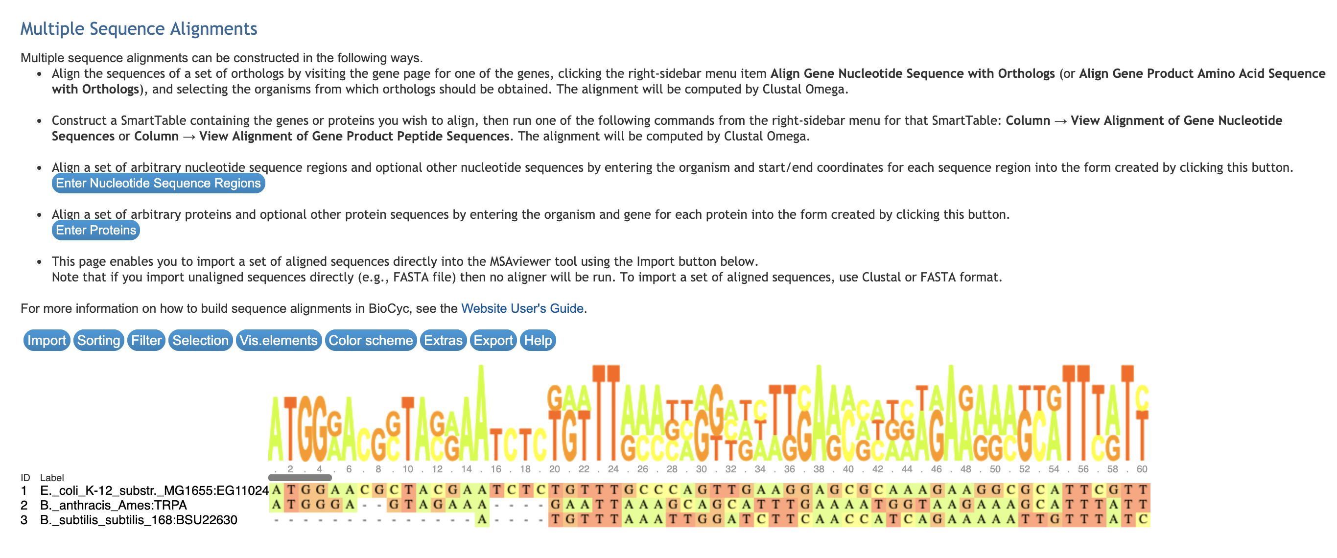
MSAViewer showing aligned DNA sequences.

MSAViewer showing aligned Protein Sequences.
MSAViewer displays a portion of the aligned sequences. Above the sequence MSAViewer displays a graphic depicting the degree of agreement at each location in the sequence. Letters corresponding to each nucleotide/amino acid are sized according to the fraction of sequences that have the particular nucleotide/amino acid at that location. Below the graphic is a scale showing the location in the alignment and a slider for moving through the graphic. To the left of the sequence display there are columns for the sequence label (generally the organism id, a colon, and the id of the gene/protein) and a label, which corresponds to the order that the organism were added the label for the sequence, which corresponds to the order they appeared in the organism selector.
There are also command buttons above the display. The following does not detail all the MSAViewer commands, for further details, consult the MSAViewer site at http:msa.biojs.net.
Note that GFF and Jalview formats are for import/export of features (not sequence data), and that the Newick format is for loading a phylogenetic tree for displaying against the aligned sequences. Files can be saved in the Fasta alignment variant, but loading such files will overwrite your BioCyc alignment.
Import
File - import features from a GFF or Jalview file or import a phylogenetic tree (Newick file) to display against the sequence.
URL, Drag and Drop, File (Fasta or Clustal options) - These will replace your BioCyc alignment with an alignment from another source, so their use is not recommended.
Sorting - sort by ID, Label, the Sequence itself, identity (similarity to the first sequence), number of gaps, or move the consensus sequence (if any) to the top.
Filter - hide columns or sequences
Selection - search for motifs with regular expressions
Vis. elements - add or remove additional graphical elements from the display
Color scheme - choose from 15 color schemes or no scheme (hides the character graphic).
Extras - add a consensus sequence to the display or navigate to a column by number.
Export
Export the full alignment or selected sequences in FASTA (alignment format) to a local file
Export features to a GFF file
Export the graphic display to a PNG file
Help
16 Translation Services
16.1 Metabolite Translation Service
This is a web service that translates metabolite identifiers between databases. To invoke the tool, choose Tools → Metabolism → Metabolite Translation Service
Metabolites may be specified by one or more of the following identifiers:
chemical name
database id (formatted as db:id, e.g., ChEBI:57912)
InChI string (preceded by InChI:)
InChI key (preceded by InChIKey:)
monoisotopic molecular weight (preceded by MW:)
chemical formula (preceded by CF:)
The recognized databases include:
Biocyc
Chebi
KEGG
PubChem
HMDB
ChemSpider
MetaboLights
MetaNetX
BiGG
Seed
Metabolites are specified in a input file or pasted to a window on the tool’s page. The file has one metabolite per line, but the metabolite can be specified using multiple identifiers (e.g., name, ChEBI id and molecular weight) separated by tabs. If the metabolite is uniquely specified by the identifiers on the line, the tool will report success and return a line of all the identifiers Pathway Tools knows for that compound. Otherwise it will report ambiguous or unknown. See the tool’s page for more details.
16.2 Map Sequence Coordinates
The DNA sequence of a replicon is sometimes updated to fix sequencing errors. Because some of the errors can involve insertions or deletions, the base-pair coordinates further downstream will shift, compared to the uncorrected sequence. This affects the positions of genes, promoter sites, and other regions of importance. BioCyc provides a tool, for a limited number of genomes, that maps base-pair coordinates between various sequence revision versions.
To invoke the tool, choose Tools → Genome → Map Sequence Coordinates.
17 How to Learn More
References